January 22th, 2026
8 Best SaaS Analytics Software of 2026: Guide + How to Choose
By Zach Perkel · 28 min read

After testing SaaS analytics software for product analytics, revenue tracking, and automated data capture, I found the 8 best platforms that deliver reliable insights across different SaaS workflows in 2026.
Expert take:
Julius is a good choice if you want natural language queries with connected data sources and repeatable analysis workflows. Mixpanel and Amplitude excel at product analytics, while Baremetrics and ChartMogul handle subscription revenue tracking. Heap automates event capture without manual tagging.8 Best SaaS analytics software: At a glance
SaaS analytics software covers everything from user behavior to revenue tracking, so the right pick depends on what metrics matter to your business. Here are the top 8 tools in 2026 compared side by side:
Tool | Best For | Starting Price (billed annually) | Key Strength |
|---|---|---|---|
Data-focused SaaS teams | Natural language queries with connected data sources | ||
Product analytics | $1200/year for 1.5M events | Event-based tracking with funnel analysis | |
User behavior tracking | Behavioral cohorts and retention analysis | ||
Auto-capture analytics | Automatic event tracking without manual setup | ||
Subscription metrics | MRR, churn, and LTV tracking for subscriptions | ||
Revenue analytics | Subscription revenue analytics with cohort reporting | ||
Web traffic insights | Free | Comprehensive traffic and conversion tracking | |
Customer journey analytics | $25.99/month, billed monthly (or pay-as-you-go) | Person-based tracking with revenue attribution |
1. Julius: Best for data-focused SaaS teams
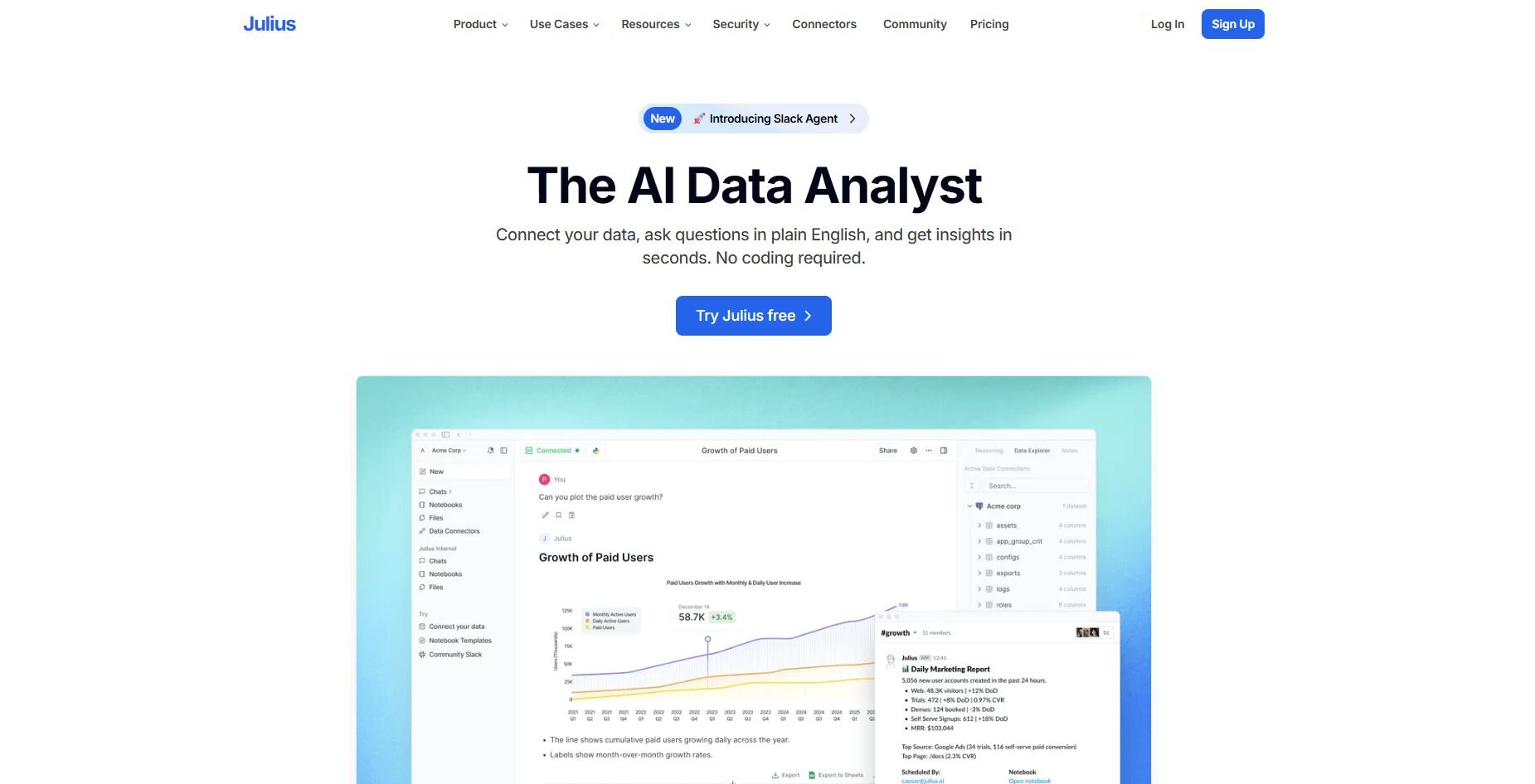
What it does: Julius is an AI-powered data analysis tool that connects to your databases, data warehouses, and business tools to generate charts, summaries, and scheduled Notebooks. You can ask questions in natural language and get visual answers without writing SQL or Python.
Who it's for: SaaS teams that need to analyze connected data sources and want quick insights without waiting for engineering support, plus analysts who want to reduce ad-hoc request volume.
We built Julius to help SaaS teams pull metrics from multiple sources without requiring SQL knowledge. When you connect Postgres, Snowflake, BigQuery, or tools like Stripe and Google Ads, you can ask questions about user growth, revenue trends, or feature adoption and get charts that show the underlying data. That cuts down the time between asking a question and seeing an answer.
The Notebooks feature lets you save recurring analyses and schedule them to run weekly or monthly. Julius refreshes the data automatically and sends results to Slack or email. That helps when you track recurring metrics like churn rates, conversion funnels, or retention cohorts without rebuilding queries each time.
Julius also learns how your tables relate to each other by building and improving a semantic layer over time. It uses that structure to pull from the correct columns and return more accurate results as you run new queries. This helps reduce errors when exploring metrics across different data sources.Key features
Natural language queries: Ask questions about your SaaS metrics and get visual answers
Data source connections: Links to Postgres, Snowflake, BigQuery, Stripe, Google Ads, and Google Drive
Scheduled Notebooks: Save recurring Notebooks that auto-refresh and deliver to Slack or email
Semantic layer: Learns table relationships to improve query accuracy over time
Export options: Export data as CSV or Excel and save charts as images for presentations
Pros
Quick setup for teams with structured data
No SQL required for exploratory analysis
Scheduled Notebooks reduce manual reporting
Cons
Requires clean, organized data sources
Better suited for analysis and reporting than always-on dashboards, which are still rolling out
Pricing
Julius starts at $37 per month.
Bottom line
2. Mixpanel: Best for product analytics
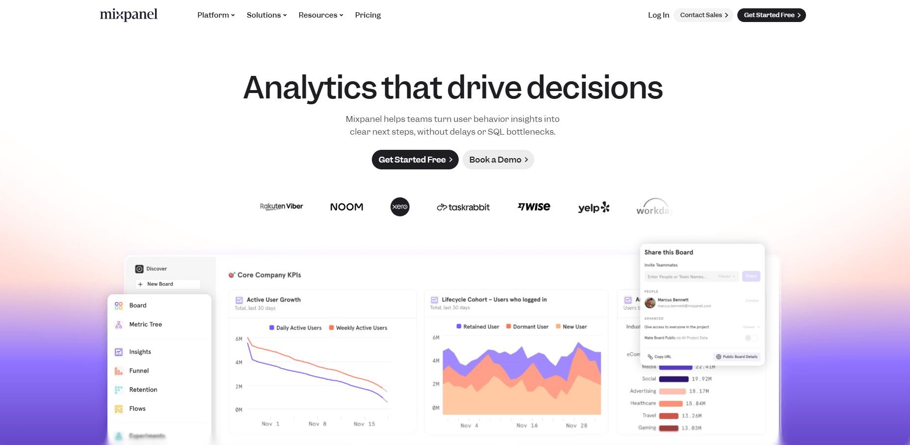
What it does: Mixpanel tracks user actions within your SaaS product through event-based analytics. It shows how users move through features, where they drop off in funnels, and which cohorts retain better over time.
Who it's for: Product teams that need to understand feature usage and conversion paths inside their application.
Mixpanel performed well when I needed to see how users moved from signup to activation. The funnel view showed exactly where people dropped off, and the breakdown by user properties revealed which segments converted at higher rates. That gave me concrete starting points for improving onboarding flows.
Segmenting users by behavior helped me compare power users against those who churned. The cohort tables showed how changes affected different signup groups over time, and I could track which features correlated with better retention.
The retention charts made it clear when engagement declined. Seeing the week-by-week dropoff helped me understand whether the product had a stickiness problem or if certain features kept people coming back consistently.Key features
Event tracking: Monitor specific user actions like button clicks, feature usage, and page views
Funnel analysis: Visualize conversion paths and identify where users drop off
Cohort reporting: Compare retention and behavior across different user groups
Pros
Clear visualization of user behavior patterns
Flexible segmentation by user properties
Strong funnel and retention analysis
Cons
Requires manual event instrumentation
Pricing scales quickly with event volume
Pricing
Mixpanel starts at $1,200 per year for 1.5M events.
Bottom line
3. Amplitude: Best for user behavior tracking
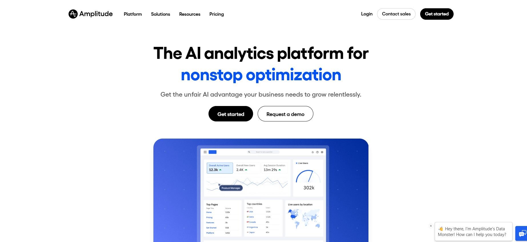
What it does: Amplitude analyzes user behavior patterns across your SaaS product by tracking events and organizing users into behavioral cohorts. It shows retention curves, feature adoption rates, and how different user segments interact with your product over time.
Who it's for: Product and growth teams that need deep behavioral analysis and cohort-based insights.
Testing Amplitude showed me how different user segments behaved after specific product changes. The behavioral cohorts grouped users automatically based on actions they took, and I could see which paths led to better retention without manually creating segments each time.
What I liked was the retention analysis. The curves showed exactly when users dropped off and which cohorts stayed engaged longer. Comparing cohorts side by side revealed that users who adopted certain features early had significantly better long-term retention rates.
The path analysis also helped me understand common user journeys. Seeing which feature combinations led to upgrades or cancellations gave me clearer direction on what to prioritize in product development and where friction points existed.Key features
Behavioral cohorts: Automatically group users based on actions and patterns
Retention curves: Track how different segments engage over time
Path analysis: Visualize common user journeys through your product
Pros
Powerful cohort analysis without manual setup
Clear retention and engagement tracking
Strong path visualization for user journeys
Cons
Steeper learning curve than simpler tools
Can be overwhelming for basic analytics needs
Pricing
Amplitude starts at $49 per month.
Bottom line
Amplitude helps teams understand user behavior patterns through automated cohorts and retention tracking. It's a strong fit when you need to compare how different user segments interact with your product over time. If you need subscription-specific metrics like MRR and churn, Baremetrics focuses on that angle.
4. Heap: Best for auto-capture analytics
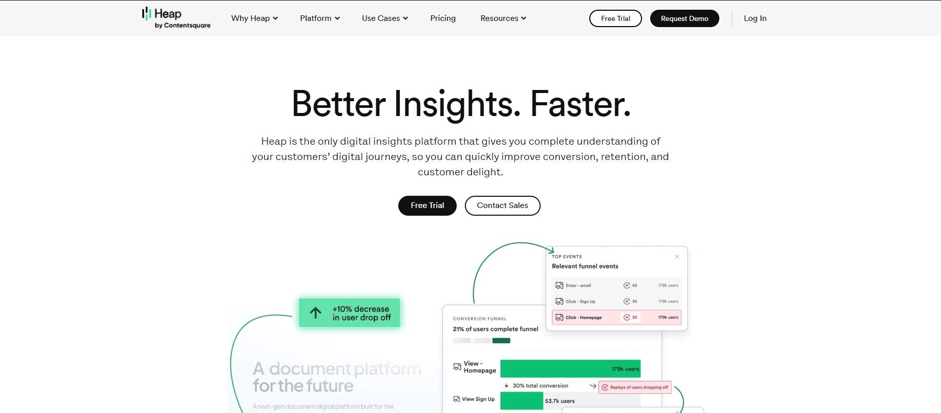
What it does: Heap automatically captures every user interaction on your website or app without requiring manual event tracking. It records clicks, page views, form submissions, and other actions retroactively, so you can analyze events you didn't know mattered when users first performed them.
Who it's for: Teams that want comprehensive analytics without spending time on event instrumentation.
I tested Heap by installing it and immediately getting data on every user action without writing tracking code. The auto-capture meant I could go back weeks later and ask questions about user behavior that I didn't think to track initially, which saved time when priorities shifted.
What helped most was the retroactive analysis. When a product manager asked about a specific button's click rate from two months ago, I had the data ready without needing to wait for new tracking to accumulate. That flexibility made exploratory analysis much faster.
The session replay feature also clarified confusing user paths. Watching how people actually navigated through the product revealed usability issues that aggregate metrics missed, and I could pinpoint exactly where users got stuck or confused.
Key features
Automatic event capture: Records all user interactions without manual tagging
Retroactive analysis: Query events from before you knew to track them
Session replay: Watch individual user sessions to understand behavior
Pros
No engineering time needed for event setup
Can analyze past behavior retroactively
Comprehensive data capture by default
Cons
Higher cost than manual tracking tools
Can generate noise from irrelevant events
Pricing
Heap uses custom pricing based on session volume.
Bottom line
5. Baremetrics: Best for subscription metrics
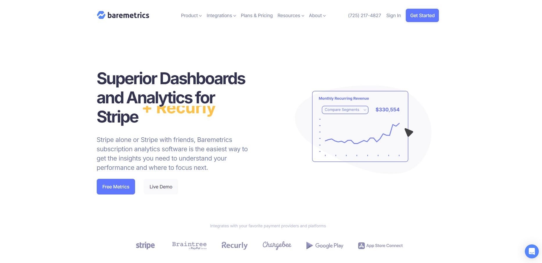
What it does: Baremetrics connects to payment processors like Stripe, Braintree, and Chargebee to track subscription revenue metrics automatically. It calculates MRR, churn rate, LTV, and other SaaS financials in real time without manual spreadsheet work.
Who it's for: SaaS companies that need accurate subscription revenue tracking and forecasting.
Baremetrics impressed me with how quickly it surfaced revenue trends after connecting to Stripe. The dashboard showed monthly recurring revenue (MRR) growth, churn breakdown by plan, and customer lifetime value (LTV) without building formulas or importing CSVs. That saved hours of manual calculation each month.
The churn analysis broke down exactly which plans and cohorts were canceling most often. Seeing that annual subscribers churned at half the rate of monthly plans helped justify pricing strategy changes, and the revenue retention cohorts showed which signup months produced the most valuable customers.
Forecasting tools also helped with planning. The revenue projections gave realistic targets for quarterly goals, and the dunning features recovered failed payments automatically, which reduced involuntary churn without extra manual follow-up.
Key features
MRR tracking: Calculate monthly recurring revenue automatically from payment data
Churn analysis: Break down cancellations by plan, cohort, and reason
Revenue forecasting: Project future revenue based on current trends
Pros
Accurate financial metrics without manual work
Clear churn breakdown by segment
Automatic failed payment recovery
Cons
Limited to subscription revenue metrics
Requires payment processor integration
Pricing
Baremetrics starts at $49 per month.
Bottom line
6. ChartMogul: Best for revenue analytics
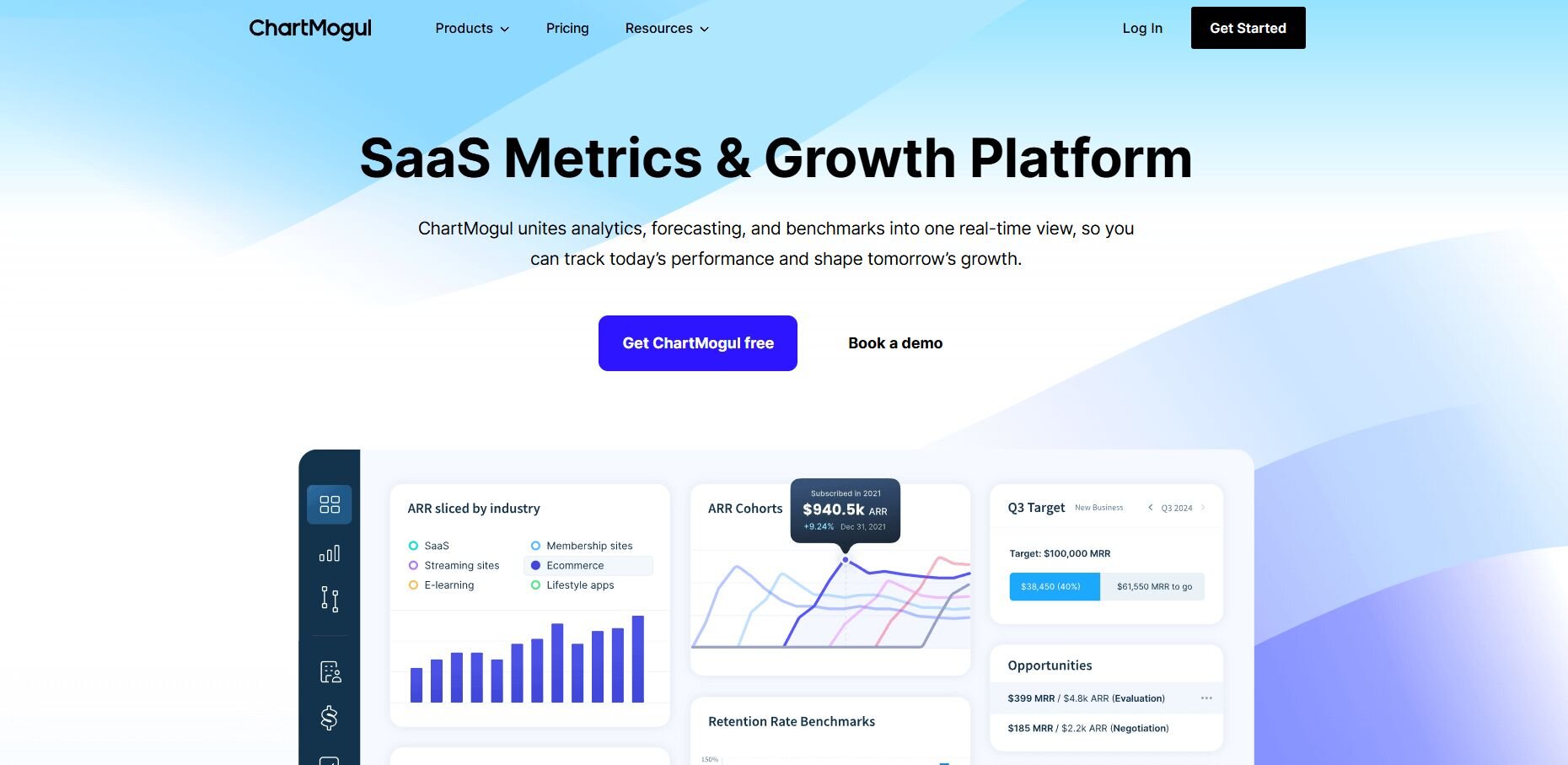
What it does: ChartMogul connects to billing systems and payment processors to analyze subscription revenue with detailed cohort reporting, expansion revenue tracking, and customer segmentation. It shows how revenue grows or contracts across different customer groups over time.
Who it's for: SaaS finance and growth teams that need detailed revenue analysis beyond basic MRR tracking.
I liked ChartMogul because the cohort tables showed exactly how revenue evolved for each signup group. Seeing which months produced customers with the highest expansion revenue helped prioritize acquisition channels, and the segmentation revealed that enterprise customers expanded at three times the rate of self-serve signups.
The revenue waterfall charts broke down growth into new revenue, expansion, contraction, and churn. That clarity made it easier for me to identify whether growth problems came from acquisition slowdowns or retention issues, and I could track which product tiers drove the most expansion revenue.
Customer movement analysis also showed upgrade and downgrade patterns clearly. Understanding which customers moved between plans helped refine the pricing strategy, and the activation metrics revealed how long it took new signups to reach their first value milestone.Key features
Cohort revenue analysis: Track how revenue changes across different signup groups
Expansion revenue tracking: Monitor upgrades and upsells by customer segment
Revenue waterfall: Break down growth into new, expansion, contraction, and churn
Pros
Detailed cohort-based revenue analysis
Clear expansion and contraction tracking
Strong segmentation capabilities
Cons
Higher price point than basic subscription tools
Requires clean billing data for accuracy
Pricing
Bottom line
7. Google Analytics 4: Best for web traffic insights
What it does: Google Analytics 4 tracks website and app traffic, showing where visitors come from, which pages they view, and how they convert. It measures user acquisition, engagement, and conversion events across your marketing funnel.
Who it's for: Marketing and growth teams that need to understand traffic sources and website conversion rates.
During testing, Google Analytics 4 gave me clear visibility into which marketing channels drove the most qualified traffic. The acquisition reports showed that organic search visitors converted at twice the rate of paid social traffic, which helped reallocate budget toward higher-performing channels.
The event tracking revealed where visitors dropped off in the signup flow. Seeing that 40% of users abandoned the form at the payment step pointed to friction in that specific area, and the page analytics showed which content pieces kept visitors engaged longest.
Audience segmentation also helped refine targeting. Comparing new versus returning visitors showed that returning users converted at five times the rate, and the demographic breakdowns revealed which geographic markets responded best to different product messaging and pricing.Key features
Traffic source tracking: See which channels drive visitors and conversions
Event measurement: Track specific actions like signups, clicks, and form submissions
Audience segmentation: Compare behavior across different visitor groups
Pros
Free
Comprehensive traffic and conversion tracking
Integrates with Google Ads and other marketing tools
Cons
Requires manual event setup for custom tracking
Steep learning curve for advanced features
Pricing
Google Analytics 4 is free to use.
Bottom line
8. Kissmetrics: Best for customer journey analytics
What it does: Kissmetrics tracks individual users across devices and sessions to show their complete journey from first visit to purchase and beyond. It attributes revenue to specific marketing channels and shows which touchpoints influence conversions.
Who it's for: Marketing and sales teams that need person-level tracking with revenue attribution.
One of the best things I noticed with Kissmetrics was how it connected individual user actions to revenue outcomes. The person-level tracking showed that users who visited the pricing page three times before signing up had higher LTV than those who converted immediately, which changed how we scored lead quality.
The revenue attribution revealed which marketing channels influenced conversions at different stages. Email campaigns rarely drove direct signups but appeared in 60% of high-value customer journeys, which justified continued investment even without immediate attribution in other tools.
Customer timeline views also made sales handoffs clearer. Seeing a prospect's complete interaction history helped sales reps personalize outreach based on which features they explored, and the cohort reports showed how different acquisition sources performed over longer time horizons.
Key features
Person-based tracking: Follow individual users across sessions and devices
Revenue attribution: Connect marketing touchpoints to actual revenue
Customer timelines: View complete user journey from first visit to purchase
Pros
Clear revenue attribution across channels
Person-level tracking across devices
Helpful for understanding long conversion cycles
Cons
Higher price point than basic analytics tools
Requires consistent user identification setup
Pricing
Kissmetrics starts at $25.99 per month, billed monthly (or pay-as-you-go).
Bottom line
How I tested these SaaS analytics tools
I connected real data sources to each platform and ran common SaaS queries. I tracked user groups, calculated churn rates, built funnels, and checked how fast each tool gave clear answers without help from a data team.
I also looked at setup time, data accuracy, and whether tools did what they promised. Some looked great in demos but needed a complex setup or perfect data. Others worked well with messy data and gave reliable results faster.
Here's what I focused on during testing:
Setup speed: How long it took to connect data sources and get the first useful insight
Query flexibility: Whether I could answer follow-up questions without hitting tool limitations
Data accuracy: How well the tool handled edge cases like refunds, plan changes, or cancelled trials
Learning curve: Whether non-technical team members could use the tool independently or needed constant data team support
Export and sharing: How easy it was to get results into presentations, emails, or Slack without manual reformatting
Cost at scale: Whether pricing stayed reasonable as data volume or user seats increased
Which SaaS analytics tool should you choose?
The right choice of SaaS analytics tool depends on what metrics matter to your business and how your team prefers to work with data. Some tools focus on product behavior, others track subscription revenue, and some handle multiple data sources through natural language queries.
Choose:
Julius if you need to analyze connected data sources with natural language queries and want scheduled reports without writing SQL.
Mixpanel if you need detailed event tracking to understand how users move through your product and where they drop off.
Amplitude if you want automated behavioral cohorts and retention analysis across different user segments.
Heap if you want comprehensive event capture without manual tagging and need retroactive analysis.
Baremetrics if you need accurate MRR, churn, and LTV calculations pulled directly from your payment processor.
ChartMogul if you want detailed revenue cohort analysis with expansion and contraction tracking.
Google Analytics 4 if you need to track website traffic sources and optimize marketing channel performance.
Kissmetrics if you need person-level tracking with revenue attribution across the entire customer journey.
My final verdict
I noticed during testing that product teams usually pick Mixpanel or Amplitude for behavioral tracking, while finance teams lean toward Baremetrics or ChartMogul for subscription metrics. Those tools excel at their specific metric categories but require you to work within their pre-built dashboards and integrations.
Julius takes a different approach by letting you query any connected data source through natural language without being locked into specific metric frameworks. You can pull from your database, Stripe, Google Ads, or data warehouse and explore whatever questions come up without waiting for pre-built reports or engineering support.
I've found that this flexibility matters when your analysis needs change frequently or when you need to combine data across sources that specialized tools don't connect.
See how Julius helps SaaS teams analyze metrics without SQL
Many SaaS analytics software tools focus on specific metric categories like product events or subscription revenue, but teams still struggle when they need to explore data across multiple sources or answer ad-hoc questions. Julius lets you query connected databases, data warehouses, and business tools by asking clear questions and getting visuals, summaries, and recurring updates without writing SQL.
Here's how Julius helps with SaaS data analysis and reporting:
Quick single-metric checks: Ask for an average, spread, or distribution, and Julius shows you the numbers with an easy-to-read chart.
Built-in visualization: Get histograms, box plots, and bar charts on the spot instead of jumping into another tool to build them.
Catch outliers early: Julius highlights values that throw off your results, so decisions rest on clean data.
Recurring summaries: Schedule analyses like weekly revenue or delivery time at the 95th percentile and receive them automatically by email or Slack.
Smarter over time: With each query, Julius gets better at understanding how your connected data is organized. It learns where to find the right tables and relationships, so it can return answers more quickly and with better accuracy.
One-click sharing: Turn a thread of analysis into a PDF report you can pass along without extra formatting.
Direct connections: Link your databases and files so results come from live data, not stale spreadsheets.
Ready to explore your SaaS metrics through natural language queries across connected data sources? Try Julius for free today.
Frequently asked questions
How do business intelligence dashboards differ from SaaS analytics tools?
What are the best marketing analysis tools for SaaS companies?
The best marketing analysis tools for SaaS companies are Google Analytics 4 for traffic tracking, Kissmetrics for revenue attribution, and Amplitude or Mixpanel for channel performance. Google Analytics shows which channels drive conversions, while Kissmetrics connects journeys to revenue. Product analytics tools reveal which sources produce users who retain long-term.
