October 27th, 2025
Top 10 Data Mining Tools in 2025 [Tested and Reviewed]
By Simon Avila · 16 min read
After testing the leading data mining tools for accuracy, speed, and usability, these 10 stood out as the most reliable in 2025.
Top 10 data mining tools in 2025: At a glance
Data mining tools range from lightweight visual platforms for exploring trends to enterprise systems designed for large-scale predictive analysis. Here’s a quick look at what each one offers, who it’s best for, and how the pricing compares:
1. Julius: Best for business users who want fast, visual insights
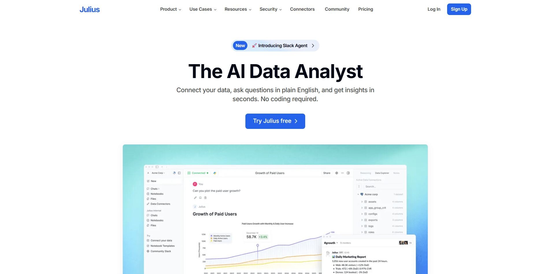
What it does: Julius is an AI-powered data analysis tool that turns raw data into visual charts and reports. It connects to sources like Google Ads, Snowflake, Postgres, and Excel, so you can analyze business performance in one place. You can also automate recurring reports and share them with your team without needing technical help.
Who it’s for: Business and operations teams that want to explore data quickly without relying on analysts or writing code.
We built Julius to make data exploration simpler for everyday business users. After connecting your data, you can ask direct questions like “Which campaigns performed best this month?” or “Where did customer churn increase?” Julius queries the data, combines it across sources, and shows the results as clear charts. It helps you catch trends that might slip by when you’re working in spreadsheets.
You can also use Notebooks to repeat analyses automatically with new data. They’re useful for tracking performance over time, like changes in sales or revenue trends. Reports can be scheduled to send to Slack or email, so your team gets updates without exporting files. Julius connects with tools like Snowflake, Google Ads, and Stripe, giving you one place to look at all your key information.
Julius accelerates business discovery by surfacing correlations, patterns, and anomalies across your data. For advanced modeling, you can export to dedicated platforms. But for most business analysis, it helps teams identify trends and track performance with clarity and speed.
Key features
Natural language analysis: Ask questions and get visual answers.
Connected data sources: Integrates with Snowflake, BigQuery, and Google Ads.
Automated reporting: Schedule dashboards to refresh and share automatically.
Notebooks for repeatable analysis: Save, reuse, and rerun analyses with updated data.
Semantic learning: Recognizes relationships between tables for faster, more accurate insights.
Pros
Fast setup for non-technical users
Clear charts and summaries in seconds
Consistent results through reusable Notebooks
Cons
Limited for deep modeling or advanced statistical work
Works best with connected, clean data sources
Pricing
Julius offers a limited free forever plan. Paid plans start at $29.16 per month, which includes advanced analysis.
Bottom line
Julius helps you get data answers quickly through natural language queries and visual reports. It saves time for teams that need visibility across multiple data sources. However, if you’re focused on complex modeling or algorithmic prediction, tools like RapidMiner or KNIME may suit you better.
2. IBM SPSS Modeler: Best for predictive analytics and data mining
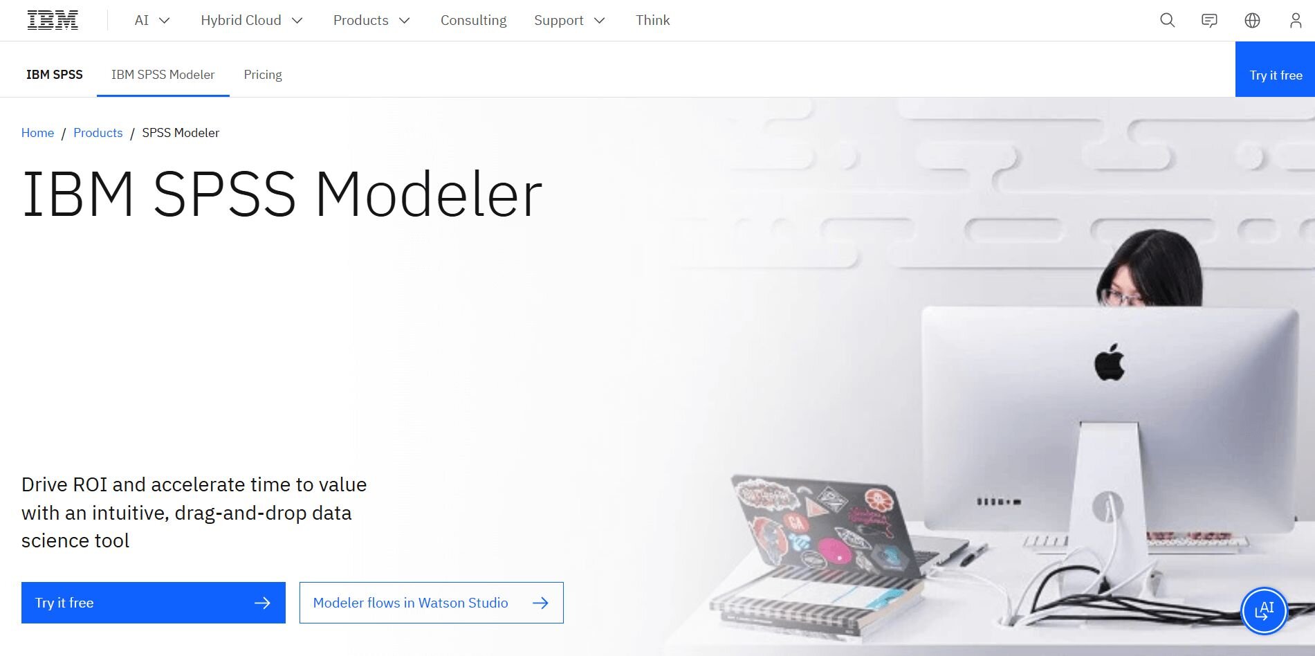
What it does: IBM SPSS Modeler supports statistical and predictive modeling through a visual workflow. It includes tools for classification, clustering, and text analysis.
Who it’s for: Analysts and researchers who need to run statistical models without programming.
IBM SPSS Modeler uses a visual interface for building predictive and statistical models without code. I used it to group customer segments based on purchasing history and found the process straightforward using the drag-and-drop canvas. It offers many prebuilt algorithms, so you can test models side by side without coding.
The text analytics feature is also useful for turning written feedback into measurable data. While setup requires some configuration, the interface keeps workflows organized once established. It’s reliable for structured mining work but less adaptable for unstructured or streaming data.
Key features
Visual modeling interface: Builds and edits workflows without scripts.
Prebuilt algorithms: Includes classification, clustering, and regression.
Text analytics: Extracts insights from written content.
Pros
Good balance between usability and depth
Wide range of modeling techniques
Easy to compare algorithm performance
Cons
Requires training for advanced features
Slower performance with large datasets
Pricing
IBM SPSS Modeler starts at $499 per month.
Bottom line
IBM SPSS Modeler gives analysts a dependable way to perform predictive and statistical mining. It’s best for structured projects that need repeatable modeling. However, teams focused on modern AutoML workflows might prefer DataRobot or H2O.ai.
3. KNIME: Best for analysts building custom workflows
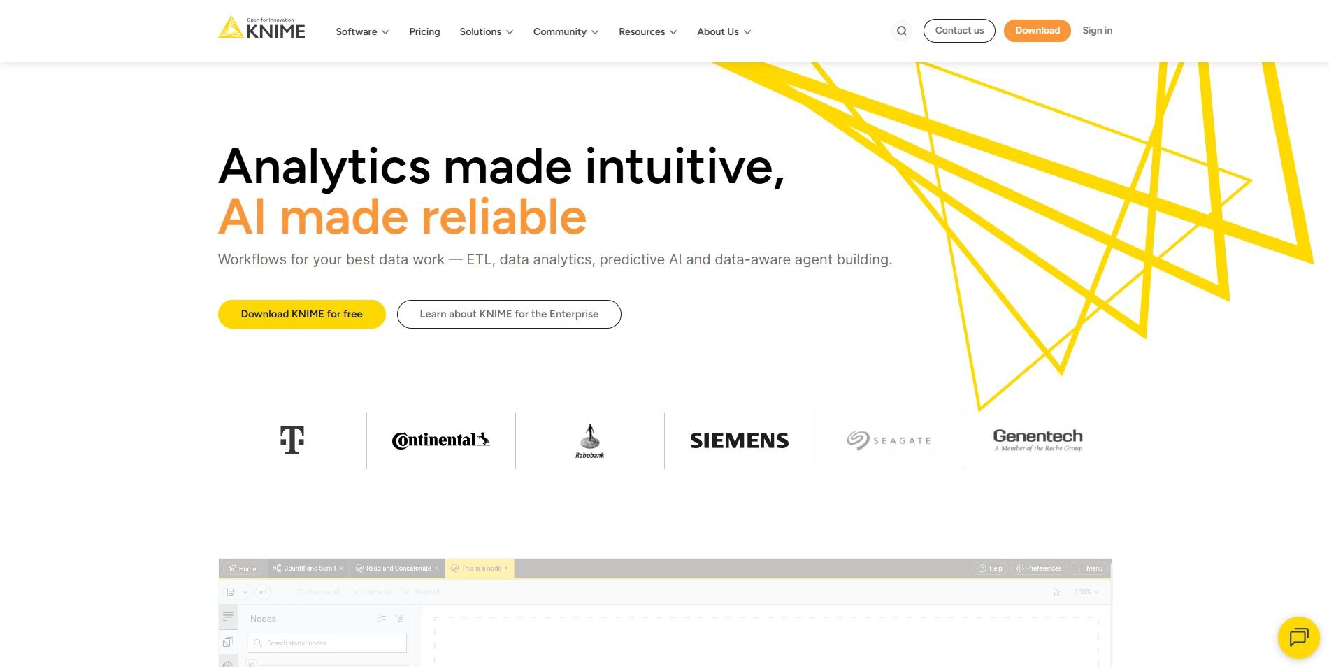
What it does: KNIME is an open-source analytics platform that lets you design data pipelines visually. It supports transformations, modeling, and integration with Python and R.
Who it’s for: Analysts who need flexibility to build and automate their own analysis workflows.
I used KNIME to connect sales and CRM data, combining and cleaning records through its node-based workflow system. The platform is flexible enough to support both simple analytics and complex data mining tools and techniques in one workspace. I tested several models for classification and found the drag-and-drop layout easy to adjust as I went.
KNIME also integrates with Python and R, which makes it more adaptable for analysts who already use those environments. During testing, I liked how it managed data connections visually, showing how each source interacted with the others. The transparency helps analysts understand relationships between datasets and build repeatable workflows that stay accurate over time.
Key features
Visual pipeline builder: Designs and adjusts workflows node by node.
Built-in modeling tools: Runs classification and clustering jobs.
Extensible integrations: Works with Python, R, and other analytics tools.
Pros
Flexible workflow customization
Good library of community nodes and templates
Strong mix of data prep and modeling tools
Cons
Interface can be dense for new users
Memory usage increases with large workflows
Pricing
KNIME starts at $19 per month for the Pro plan.
Bottom line
KNIME gives analysts full control over how data is processed and modeled. It’s practical for teams that want an adaptable mining workflow. However, users looking for a faster setup or less configuration may prefer Zoho Analytics or Power BI.
4. Orange: Best for beginners learning data mining concepts
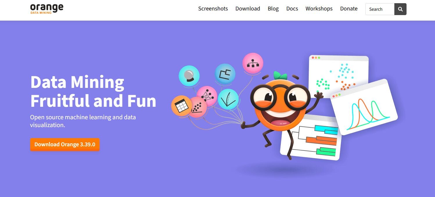
What it does: Orange is a visual data mining tool that supports basic analytics, clustering, and classification through an easy interface.
Who it’s for: Students, researchers, and beginners who want to learn the basics of data mining and visualization.
Orange is one of the most approachable data mining programs available. I tested it with a small dataset to perform clustering and classification, and the process was simple to follow through its widget-based design. Each module represents a stage in the analysis, from input to output, so you can see the data move step by step.
It’s helpful for learning concepts like correlation and segmentation because the results are visual and easy to interpret. I also liked that Orange includes text and network analysis add-ons for broader exploration. It’s not built for enterprise mining, but it’s reliable for students and small projects focused on learning fundamentals.
Key features
Widget-based workflows: Builds models step by step.
Clustering and classification: Includes basic mining algorithms.
Add-ons: Expands to text and network analysis.
Pros
Easy to learn and use
Clear visuals for educational purposes
Lightweight installation and setup
Cons
Limited scalability for large datasets
Few options for automation or scheduling
Pricing
According to its licensing information, Orange is free.
Bottom line
Orange is a straightforward introduction to data mining. It helps users understand how algorithms work and visualize patterns. However, analysts handling larger datasets or complex pipelines will need a tool like KNIME or RapidMiner.
5. Altair RapidMiner: Best for analysts exploring end-to-end mining
What it does: RapidMiner supports the entire data mining process from preparation to modeling and validation. It combines a drag-and-drop interface with scripting for deeper customization.
Who it’s for: Analysts who need end-to-end control over mining workflows and predictive modeling.
Altair RapidMiner connects every step of analysis, from data preparation to validation, in one workspace. I used it to build customer segmentation workflows and found the automation tools efficient for testing models side by side. The interface supports visual and scripted work, so you can move between both styles easily.
It also includes clear visual data mapping, showing how each source contributes to a project. I appreciated how the results view simplified data interpretation, displaying which variables influenced outcomes most. RapidMiner connects well with external databases and APIs, making it reliable software for data mining in production environments. It’s strong for analysts who want control over each stage of the process.
Key features
End-to-end workflow design: Covers preparation, modeling, and validation.
Model comparison: Evaluates performance across algorithms.
Hybrid interface: Mixes drag-and-drop and code customization.
Pros
Comprehensive data mining coverage
Balanced between simplicity and control
Reliable validation tools
Cons
Can be resource-heavy
Requires learning time for complex processes
Pricing
Altair RapidMiner offers custom pricing. Request a demo to learn more.
Bottom line
RapidMiner supports full data mining pipelines and model evaluation in one environment. It’s a strong fit for teams that balance coding and visual workflows. However, smaller businesses that need lighter analytics may find KNIME or Power BI easier to adopt.
6. H2O.ai: Best for hybrid teams scaling AutoML
What it does: H2O.ai automates machine learning model creation and optimization across large datasets. It helps teams train, evaluate, and deploy predictive models with less manual setup.
Who it’s for: Hybrid teams that need AutoML tools for predictive modeling and analytics at scale.
H2O.ai automates many of the manual steps required in model development. I tested it using structured business data for customer churn analysis, and it automatically trained several models while ranking them by accuracy and performance. The interface provided detailed metrics, making it easy to see how each variable contributed to the final result.
I liked that it connected with Python and R for deeper adjustments when needed. While the setup requires some technical understanding, the workflows are consistent once running. H2O.ai’s open-source flexibility makes it practical for hybrid teams that combine data scientists and analysts in shared projects.
What it does: H2O.ai automates machine learning model creation and optimization across large datasets. It helps teams train, evaluate, and deploy predictive models with less manual setup.
Who it’s for: Hybrid teams that need AutoML tools for predictive modeling and analytics at scale.
Key features
AutoML: Automates feature selection, model training, and optimization.
Open-source integration: Works with Python, R, and Spark.
Explainable AI: Displays accuracy and variable influence for every model.
AutoML: Automates feature selection, model training, and optimization.
Open-source integration: Works with Python, R, and Spark.
Explainable AI: Displays accuracy and variable influence for every model.
Pros
Scalable for large datasets
Flexible across open-source tools
Transparent performance reporting
Scalable for large datasets
Flexible across open-source tools
Transparent performance reporting
Cons
Requires some technical knowledge
Setup can take time for new users
Requires some technical knowledge
Setup can take time for new users
Pricing
H2O.ai pricing is custom. Request a demo to learn more.
Bottom line
H2O.ai supports predictive modeling at scale and makes advanced automation more accessible for mixed-skill teams. It’s strong for model testing and refinement. However, non-technical users may find simpler interfaces like Vertex AI or KNIME easier to start with.
7. SAS Enterprise Miner: Best for enterprises needing reliability
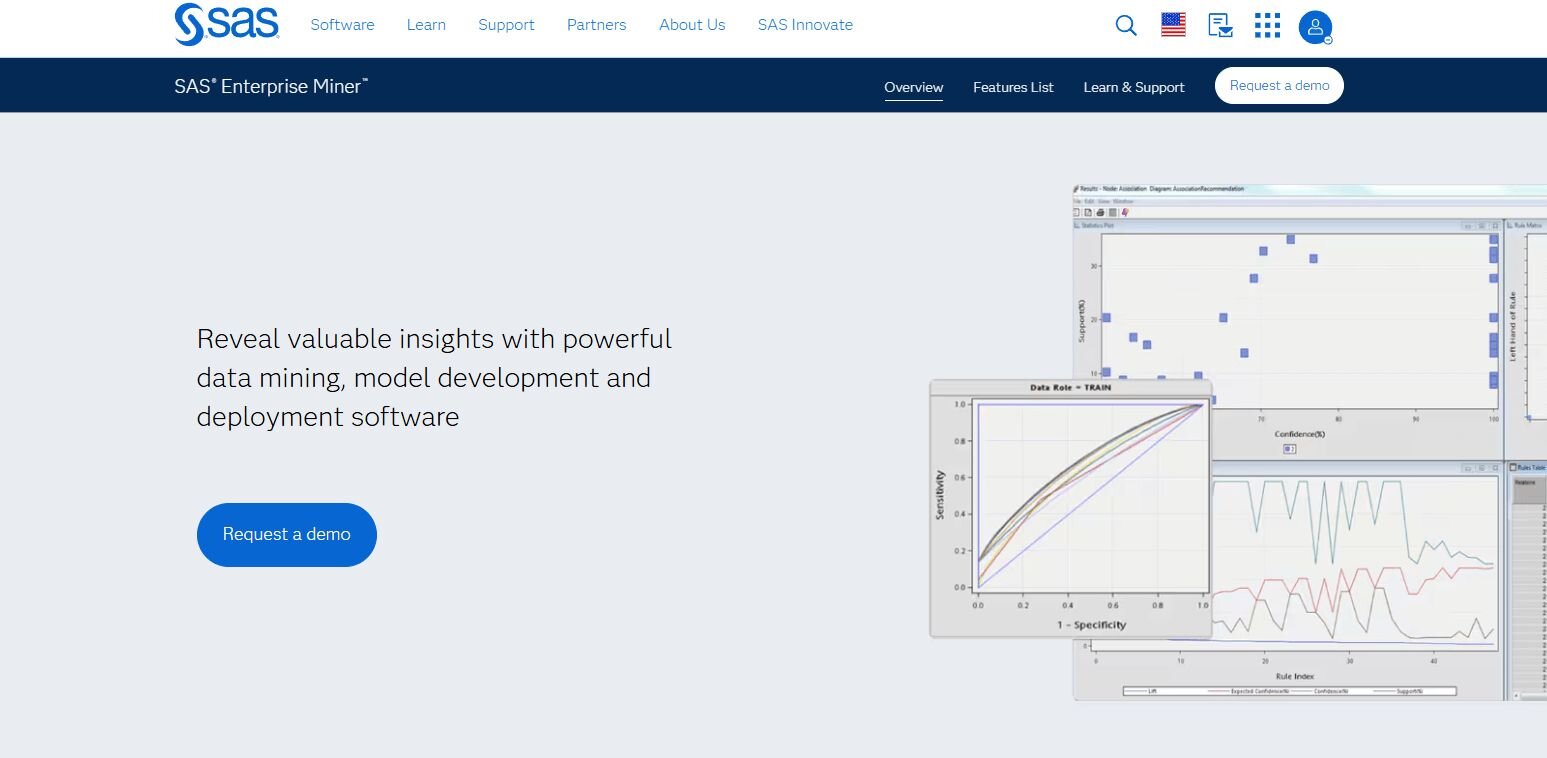
What it does: SAS Enterprise Miner supports large-scale predictive modeling and statistical analysis for enterprise teams. It includes tools for regression, clustering, and decision trees.
Who it’s for: Enterprises that need reliable, long-term analytics and strict data governance.
I tested SAS Enterprise Miner on several structured datasets to identify customer churn patterns and found its algorithms stable and repeatable. The visual workflow makes it easier to trace how data moves through each step of the process, which helps with compliance and documentation.
I liked that models could be rerun on new datasets with minimal adjustment, keeping reporting consistent across projects. I will say that the interface is dated, but it’s functional once you understand its structure. It’s also slower than newer tools, but dependable for teams that require full control over their modeling environment.
Key features
Advanced modeling: Supports clustering, regression, and decision trees.
Workflow management: Reuses existing models across new datasets.
Enterprise compliance: Includes audit trails and reporting tools.
Pros
Reliable performance for structured data
Strong documentation and support
Built for long-term enterprise use
Cons
Outdated interface design
Expensive licensing structure
Pricing
SAS Enterprise Miner offers custom pricing. Request a quote to learn more.
Bottom line
SAS Enterprise Miner remains a dependable option for enterprise-scale predictive analytics. It’s ideal for regulated industries that value traceability. However, teams looking for faster automation or modern visuals may prefer H2O.ai or RapidMiner.
8. Tableau: Best for business teams exploring data visually
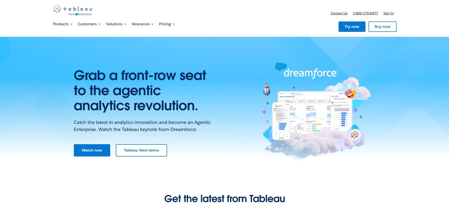
What it does: Tableau helps users create dashboards and visual reports from connected data sources. It combines live data access, AI forecasting, and shareable reports.
Who it’s for: Business users who want to visualize and explore data without coding.
Tableau makes visual analysis straightforward. I used it to build a dashboard combining marketing and financial data, and the setup took only a few minutes once connections were in place. The drag-and-drop interface made chart creation simple, and filters updated visuals in real time. I found its forecasting tools helpful for estimating near-term revenue trends.
It also connects well with SQL and cloud databases, keeping data live instead of static. Sharing reports through Tableau Cloud made collaboration easier across departments. It’s a solid option for business users who focus on data interpretation and presentation more than statistical modeling.
Key features
Interactive dashboards: Creates and updates charts in real time.
AI forecasting: Estimates short-term performance patterns.
Live data connections: Links SQL, spreadsheets, and cloud databases.
Pros
Clear visual design and layout
Supports real-time collaboration
Broad connectivity across platforms
Cons
Limited modeling depth
Requires training for complex dashboards
Pricing
Tableau starts at $75 per user per month for the Creator license.
Bottom line
Tableau helps teams translate raw data into visual stories and accessible reports. It’s well-suited for performance tracking and presentations. However, analysts working on detailed modeling may prefer RapidMiner or KNIME.
9. Sisense: Best for business teams that want to uncover insights without coding
What it does: Sisense integrates data analytics, visualization, and AI-supported insights in one interface. It helps users build dashboards and detect patterns without programming.
Who it’s for: Business teams that want fast access to insights from multiple data sources.
I tested Sisense by importing data from CRM, financial, and inventory systems, and it joined the datasets quickly without manual setup. The AI engine highlighted related variables that showed connections between sales and customer activity.
Dashboards were easy to adjust using a drag-and-drop builder, and sharing results through links was simple. While the advanced customization options depend on add-ons, the base system handles most reporting jobs well. Sisense focuses on clarity, making it a good option for teams that want to explore data relationships without coding or complex configuration.
Key features
AI-supported analysis: Highlights patterns and correlations in data.
Dashboard builder: Creates visuals through a simple interface.
Data integration: Combines multiple systems into one workspace.
Pros
Fast to set up and use
Handles multi-source data well
Easy to share dashboards
Cons
Add-ons may be required for customization
Limited predictive modeling features
Pricing
Sisense offers custom pricing based on deployment scale and number of users.
Bottom line
Sisense is practical for teams that prioritize clear reporting over statistical modeling. It simplifies discovery and collaboration. However, analysts looking for deeper predictive control may prefer Alteryx or Tableau.
10. Qlik Sense: Best for business users exploring data visually
What it does: Qlik Sense uses an associative analytics engine to explore and visualize data interactively. It shows how datasets connect and supports AI-generated summaries.
Who it’s for: Business users who need an intuitive, self-service platform for real-time exploration.
I liked how well Qlik Sense performs in interactive exploration. I used it to analyze regional and product-level sales, and its associative engine automatically identified relationships between fields without predefined queries. This made it easier to see patterns that traditional SQL setups might miss. The interface allowed me to click through visuals and refine filters pretty quickly.
Qlik Sense handled larger data volumes without slowing down and generated text summaries for each view. I found it helpful for discovering insights quickly without relying on data analysts. While initial configuration takes effort, Qlik Sense delivers flexible analysis once connected.
Key features
Associative engine: Finds links between datasets automatically.
Interactive visuals: Updates results as users explore.
AI summaries: Generates quick written explanations of trends.
Pros
Strong at visual exploration
Responsive even with large datasets
Clear and adaptable interface
Cons
Takes time to configure
Less depth for advanced modeling
Pricing
Qlik Sense offers custom pricing with four plans to choose from.
Bottom line
Qlik Sense helps teams explore and understand data relationships in real time. It’s a reliable choice for visual discovery and interactive analysis. However, those focusing on predictive or algorithmic mining may find KNIME or RapidMiner better aligned.
How I tested these data mining tools
I worked with each platform using datasets from marketing performance, financial reports, and customer operations. The goal was to see how well each tool handled practical data mining jobs like cleaning, merging, and discovering patterns that lead to decisions.
I ran live analyses, tested automation features, and checked how easily reports could be shared with other users. I also focused on how each platform performed in business conditions, not controlled demos or feature lists.
Here’s what I looked at during testing:
Setup and onboarding: How quickly I could connect data sources and start running analyses without long configuration steps.
Data handling quality: Whether the tool managed joins, outliers, and missing values accurately during data preparation.
Pattern discovery: How effectively it identified correlations, clusters, or trends during exploratory analysis.
Automation and repeatability: If reports and workflows could refresh automatically with updated data.
Ease of explanation: How clearly the tool presented results and supported accurate data interpretation.
Collaboration: How well teams can share dashboards, models, or outputs across departments.
Scalability: Whether performance held steady as the dataset size or complexity increased.
These standards made it clear which platforms are ready for real data mining work and which ones still demand too much setup for everyday business use.
Which data mining tool should you choose?
No single platform fits every team. The right choice depends on how technical your users are, how much data you manage, and whether you prioritize automation, visualization, or predictive modeling. Choose:
Julius if you want to explore connected business data through natural language questions and get clear visual answers without technical setup.
Zoho Analytics if you need quick visual reports and forecasting with minimal coding.
Microsoft Power BI if your business runs on Microsoft 365 and needs easy collaboration across teams.
Alteryx if you want no-code data automation with predictive modeling in repeatable workflows.
Vertex AI if you’re training machine learning models through Google Cloud without coding.
DataRobot if you need enterprise-grade AutoML for operational forecasting.
IBM SPSS Modeler if you rely on statistical models and want a visual drag-and-drop interface.
KNIME if you want to build flexible workflows that mix data prep, analysis, and automation.
Orange if you’re learning data mining fundamentals and want an easy, visual interface.
Altair RapidMiner if your team needs full end-to-end control from data prep to validation.
H2O.ai if you’re managing large datasets and want scalable, explainable AutoML.
SAS Enterprise Miner if you need reliable, auditable modeling for enterprise-level data.
Tableau if your priority is visual exploration and live dashboards for business users.
Sisense if you want clear dashboards and AI-supported discovery without coding.
Qlik Sense if you prefer interactive data exploration that highlights relationships automatically.
My final verdict
Each platform in this list tackles a different challenge within data mining. Together, they cover everything from deep statistical modeling to quick, visual reporting.
Julius serves as a practical bridge between exploration and deeper analysis. It helps teams explore connected data without needing to write queries or build custom dashboards. Users can ask questions directly, review charts, and identify useful patterns early in the analysis process. This makes it easier to confirm trends or relationships before moving into more technical modeling.
KNIME and RapidMiner give analysts a structure for building workflows, while H2O.ai and DataRobot focus on automated modeling. Tableau and Power BI make visualization accessible across teams, and Alteryx supports enterprise-level automation. For quick reporting, Zoho Analytics and Sisense continue to perform well.
Overall, Julius adds accessibility and speed to daily data work, making analysis more practical for every team.
How Julius can help with data analysis
Data mining tools make it possible to uncover relationships and trends that aren’t obvious at first glance. Julius simplifies that process by letting you explore data in natural language instead of manually writing SQL or scripts. It connects directly to your databases and files, then delivers charts, summaries, and insights you can share instantly.
Here’s how Julius helps with data mining and everyday analysis:
Quick single-metric checks: Ask for an average, spread, or distribution, and Julius shows you the numbers with an easy-to-read chart.
Built-in visualization: Get histograms, box plots, and bar charts on the spot instead of jumping into another tool to build them.
Catch outliers early: Julius highlights values that throw off your results, so decisions rest on clean data.
Recurring summaries: Schedule analyses like weekly revenue or delivery time at the 95th percentile and receive them automatically by email or Slack.
Smarter over time: With each query, Julius gets better at understanding how your connected data is organized. That means it can find the right tables and relationships faster, so the answers you see become quicker and more precise the more you use it.
One-click sharing: Turn a thread of analysis into a PDF report you can pass along without extra formatting.
Direct connections: Link your databases and files so results come from live data, not stale spreadsheets.
Ready to see how Julius can help make analysis faster and more accessible? Try Julius for free today.
Frequently asked questions
What are data mining tools?
Data mining tools are platforms that help you find patterns, trends, and relationships in large datasets. They use algorithms for classification, prediction, and pattern discovery so you can make informed decisions. Most include visual dashboards, automation, and statistical modeling to turn raw data into actionable insights.
What kinds of companies use data mining tools?
Companies like retailers, banks, manufacturers, and healthcare providers use data mining solutions to identify trends, forecast demand, and reduce risk.
What is correlation analysis in data mining?
Correlation analysis measures how strongly two variables move together, helping you understand relationships within your data. It’s often used to find dependencies between sales, pricing, or customer behavior.
Is financial analysis software part of data mining?
Yes, financial analysis software often includes data mining features for modeling revenue, expenses, and risk. These tools analyze transactions, track cash flow, and forecast financial outcomes using historical data. They help finance teams understand performance and plan more accurately.
How does cluster analysis work in data mining tools?
Cluster analysis helps you find natural groupings in your data, such as customer segments or product categories, by comparing multiple variables at once. Data mining tools use it to organize large datasets into clear patterns, making it easier for you to understand differences between groups and make more targeted decisions.
What’s the difference between data mining and data analysis?
Data mining uncovers new patterns and relationships, while data analysis measures and confirms known information. You use data mining tools to discover insights and analysis techniques to validate and report results.
