January 23th, 2026
16 Best Data Analysis Tools: Features & How to Choose [2026]
By Drew Hahn · 31 min read
I spent months testing data analysis tools across marketing reports, budget tracking, and team dashboards. Here are the 16 platforms that helped me spot trends and answer business questions in 2026.
16 Best data analysis tools: At a glance
The tools below include spreadsheets, BI platforms, programming languages, and cloud services for different workflows. Here’s how they compare side-by-side:
Tool | Best For | Starting Price (billed annually) | Key Strength |
|---|---|---|---|
Business users | Natural language queries that improve in accuracy over time | ||
Spreadsheet analysis | $6/user/month for businesses | Familiar interface with built-in formulas | |
Collaborative spreadsheets | Free | Real-time team collaboration | |
Visual dashboards | $75/user/month for a Creator license | Drag-and-drop visualization builder | |
Business intelligence reporting | Deep Microsoft ecosystem integration | ||
Modern BI platform | SQL-based modeling layer | ||
Associative analytics | $200/month for 10 users | Explores data relationships dynamically | |
Database querying | $2,140/year for MySQL Standard Edition | Direct data extraction from databases | |
Custom data analysis | Free | Flexible programming with extensive libraries | |
Statistical computing | Free | Advanced statistical modeling capabilities | |
Data science workflows | Visual workflow design for models | ||
Open-source analytics | $19/month, billed monthly | Node-based workflow without coding | |
Big data processing | Free | Open-source engine for processing massive datasets with SQL, streaming, and ML modules | |
Cloud data platform | Unified cloud storage and processing for analytics and AI workloads | ||
Enterprise analytics | Comprehensive statistical analysis suite | ||
Technical computing | Matrix operations and algorithm development |
1. Julius: Best for AI-powered data analysis
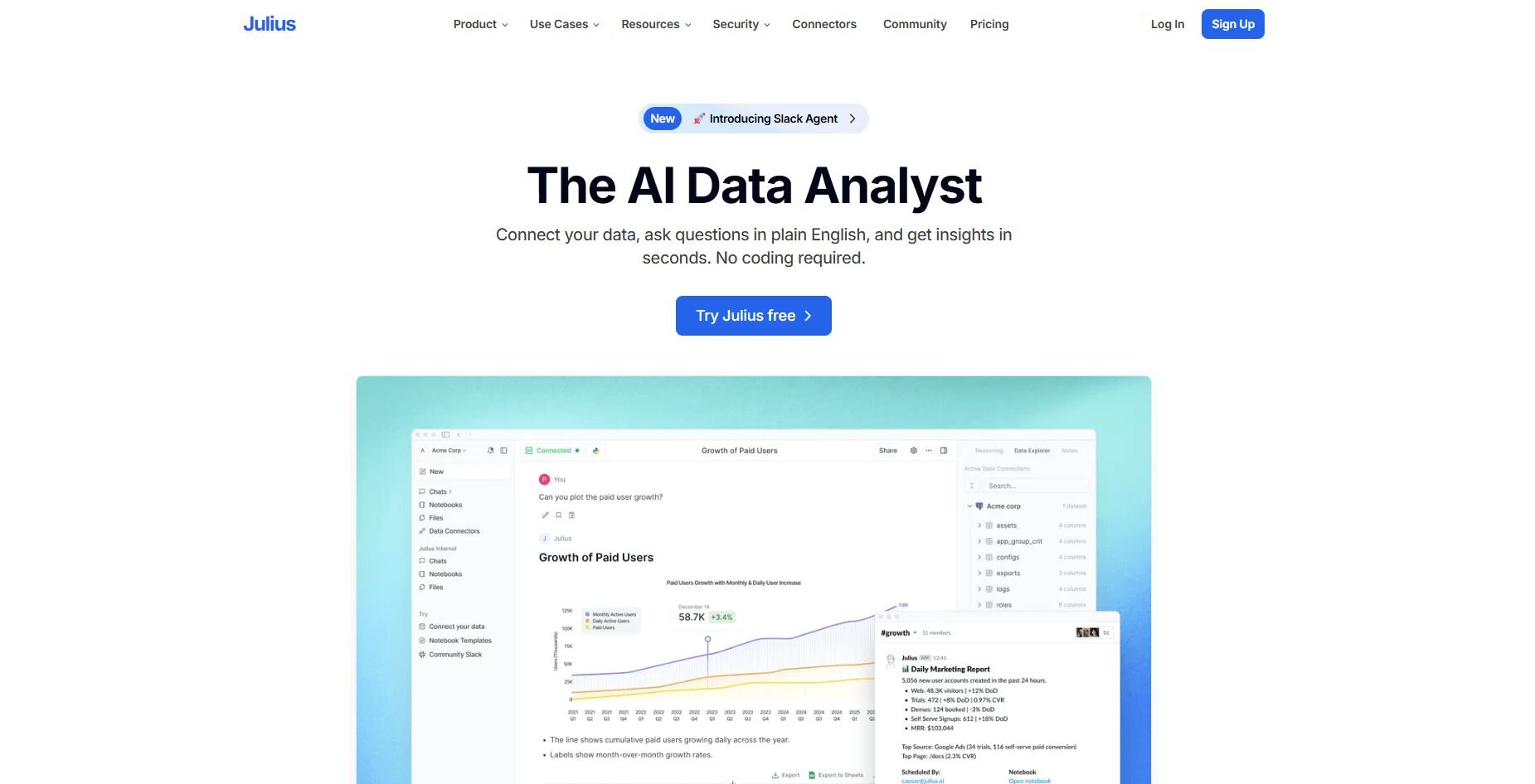
What it does: Julius is an AI-powered data analysis tool that turns your data into charts, summaries, and scheduled reports through natural language questions. You connect databases or upload files, ask what you want to know, and get visual answers without writing SQL or Python.
Who it's for: Business users who need fast insights from structured data without coding.
We built Julius to help teams analyze data through conversation instead of writing SQL queries. You can ask about revenue trends, customer segments, or campaign performance and get charts that link back to the source tables. That connection helps you verify numbers before adding them to reports.
Julius also includes Notebooks for recurring analysis. You set up a workflow once, schedule it to refresh weekly or monthly, and receive updates in Slack or email. This keeps ongoing checks organized without rebuilding the same analysis each time.
Over time, Julius learns how your tables connect through its Learning Sub Agent. It maps relationships between tables and understands column meanings as you run queries, so answers get more accurate and consistent with each use.
Key features
Natural language querying: Ask questions and get charts without SQL
Saved workflows and notebooks: Reuse analysis with scheduled updates
Integrations with Google Ads, BigQuery, and Drive: Connect live data sources
Scheduled reports via email or Slack: Automate recurring checks
Learning Sub Agent: Improves accuracy by understanding your data structure over time
Pros
Quick setup for business users
Automated recurring reports
Gets better at understanding your data with use
Cons
Works best with structured data sources
Limited for deep statistical modeling
Pricing
Julius starts at $37 per month.
Bottom line
2. Microsoft Excel: Best for spreadsheet analysis
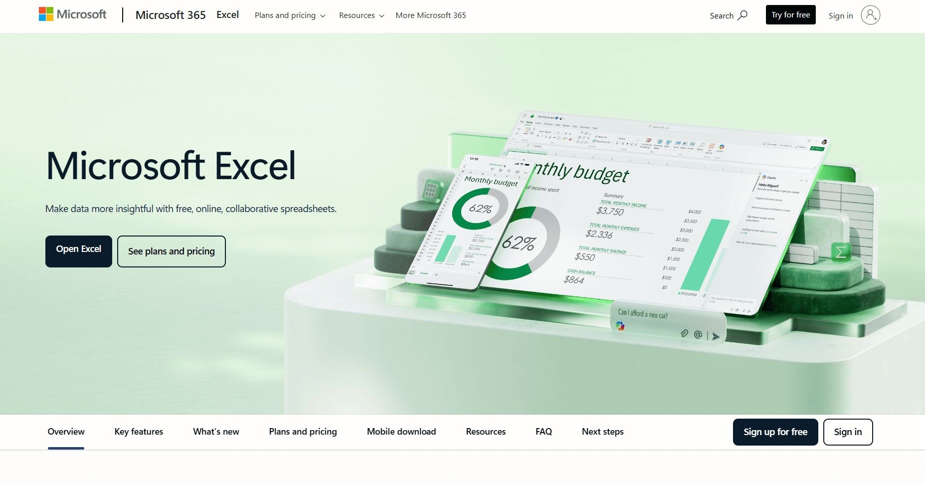
What it does: Excel lets you analyze and organize data in rows and columns with built-in formulas for calculations, pivot tables for summaries, and charts for visualization. It handles everything from budget tracking to sales reporting through a familiar grid interface that most business users already know.
Who it's for: Business users who work with structured data and need reliable calculations without learning new software.
I used Excel for budget tracking, sales reports, and date calculations with its built-in formulas. Pivot tables grouped data by region and product, which made monthly reviews faster.
The chart builder turned spreadsheets into line graphs and bar charts quickly. I liked that I could compare quarterly sales and track spending without switching tools. Files stayed formatted when I shared them with teammates.
Excel worked well with datasets under 100,000 rows, but my larger files slowed down. Complex calculations meant nesting multiple formulas that became hard to follow.Key features
Built-in formula library: Covers financial, statistical, and logical operations
Pivot tables: Summarize and group data by multiple dimensions
Chart builder: Creates visual comparisons from tabular data
Pros
Familiar interface for most business users
Strong calculation and formatting options
Works offline with local files
Cons
Slows down with datasets over 100,000 rows
Complex formulas get difficult to manage
Pricing
Microsoft Excel starts at $6 per user per month for Microsoft 265 Business Basic.
Bottom line
3. Google Sheets: Best for collaborative spreadsheets
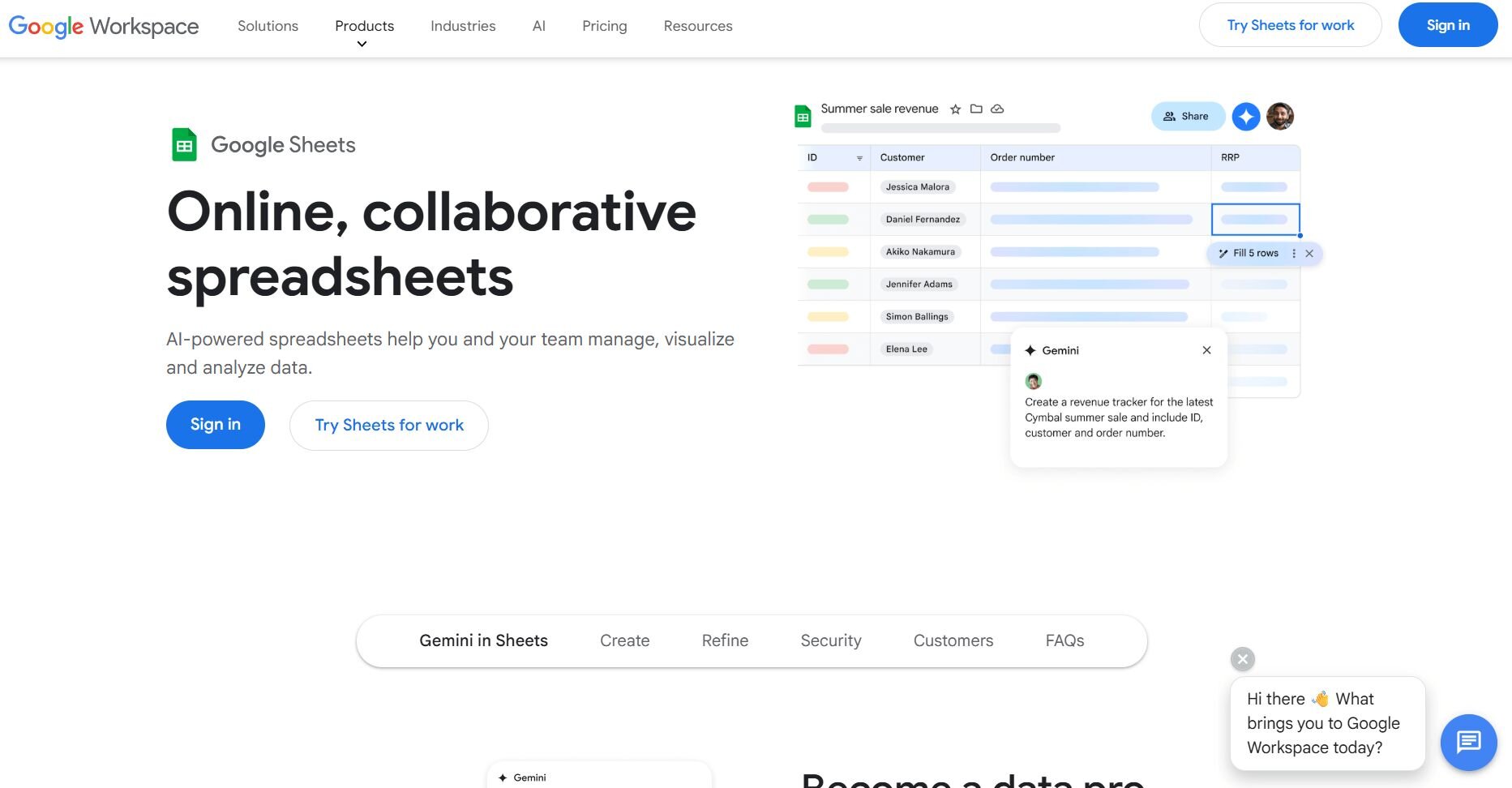
What it does: Google Sheets lets you analyze data through spreadsheets with real-time collaboration, built-in formulas, and cloud storage. Multiple people can edit the same file at once, and everyone sees changes instantly. It connects with other Google Workspace tools and runs entirely in your browser.
Who it's for: Teams that need shared access to spreadsheets and real-time updates without version control issues.
I tracked campaign metrics in Google Sheets with our marketing team. Three of us worked on edits, and I watched their changes appear in real time.
The comment system lets teammates ask questions on specific cells. I used built-in formulas for calculations and connected Google Forms responses to auto-populate new rows. Everything synced across devices without downloading files.
Google Sheets handled my standard analysis testing well, but slowed down around 50,000 rows. Complex formulas ran slower in Google Sheets than on desktop tools. I also noticed some advanced Excel features were missing.Key features
Real-time collaboration: Multiple users edit simultaneously
Cloud-based access: Works from any device with a browser
Google Workspace integration: Connects with Forms, Drive, and other tools
Pros
No version control conflicts
Free for personal use
Automatic cloud backup
Cons
Slows down with large datasets
Limited advanced formula support
Pricing
Bottom line
4. Tableau: Best for visual dashboards
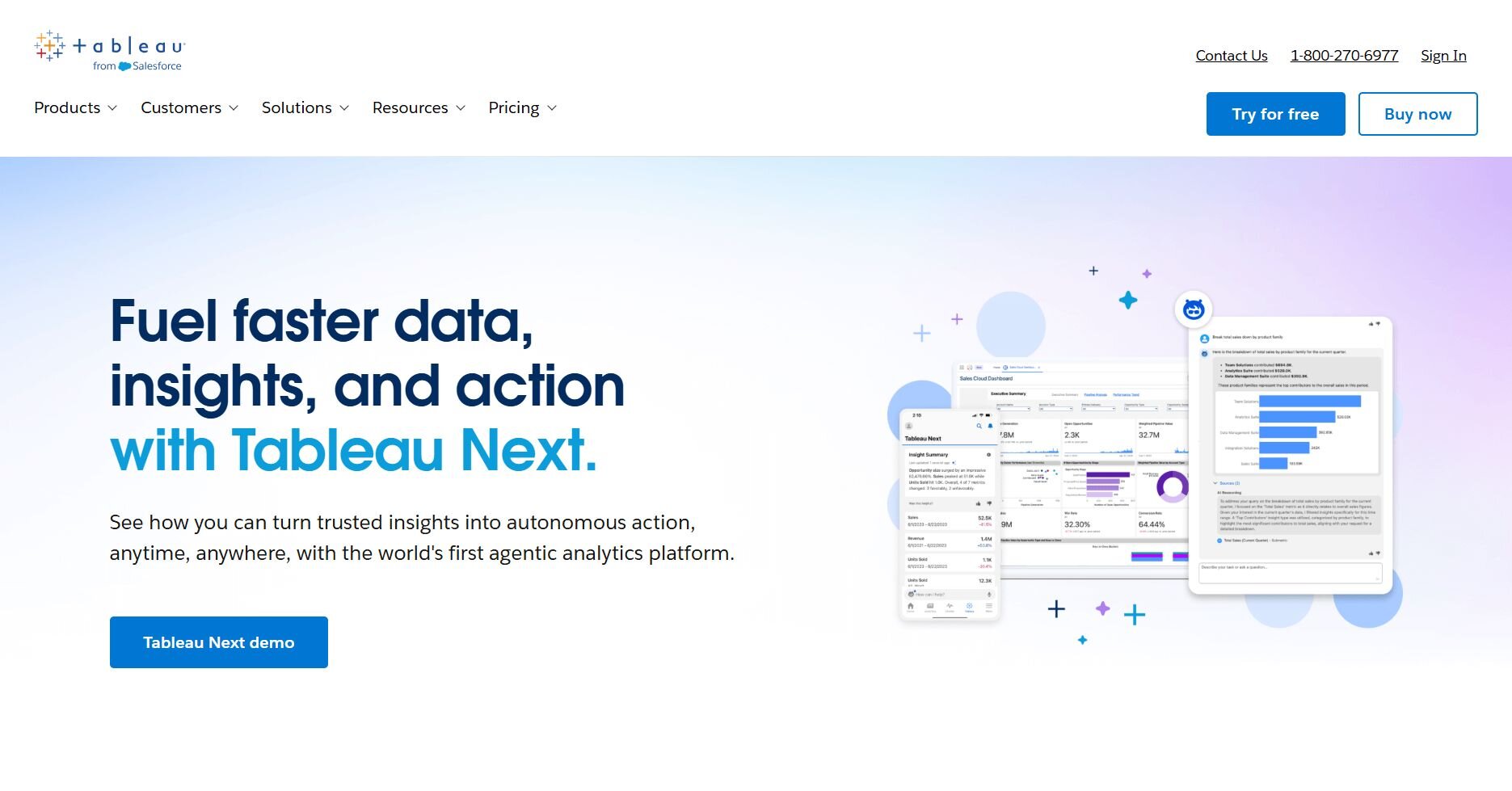
What it does: Tableau is a data visualization platform that lets you analyze data by building interactive dashboards through drag-and-drop controls. You can link multiple data sources, create custom calculations, and publish dashboards for team viewing. It handles complex datasets and supports detailed visual customization.
Who it's for: Business analysts and data teams who need polished dashboards for reporting and presentations.
Tableau let me combine sales data, web traffic, and customer records into one dashboard that updated when I filtered by region. The drag-and-drop builder made it easy to test different charts without starting over.
I spent time learning the interface before I could build useful dashboards. Once I understood how it worked, I created views that let users explore data on their own. Sharing through Tableau Server worked well for teams, but adding more users cost more.
Key features
Drag-and-drop interface: Build dashboards without coding
Multiple data connections: Combine sources in one view
Interactive filters: Let users explore data themselves
Pros
Handles large datasets smoothly
Extensive visualization options
Strong for presentation-ready dashboards
Cons
Steeper learning curve for new users
Licensing costs increase with team size
Pricing
Tableau starts at $75 per user per month for a Creator license.
Bottom line
5. Power BI: Best for business intelligence reporting
What it does: Power BI is Microsoft's business intelligence platform that lets you analyze data and build reports by connecting to Microsoft products, databases, and cloud services. It has AI features to help you find insights, create custom calculations, and schedule automatic report updates. You can share results with your team or add visuals to other Microsoft apps.
Who it's for: Business teams already using Microsoft tools who need integrated reporting and analysis.
I connected Power BI to Excel files, SQL databases, and SharePoint lists to build a revenue dashboard. The Microsoft integration let me pull data from Teams, Dynamics, and Azure without extra setup.
Learning Power BI's DAX formula language took time, but it let me build custom calculations. Once I understood it, I created metrics like year-over-year growth and rolling averages. Power BI updated reports on a schedule, which kept dashboards current.
The free version worked for solo reports. Team sharing needed paid licenses, and I had fewer visual options compared to Tableau.Key features
Microsoft ecosystem integration: Connects seamlessly with Office, Azure, and Dynamics
AI-powered insights: Detects trends and patterns automatically
Scheduled refreshes: Updates reports without manual work
Pros
Works natively with Microsoft products
Lower cost than some BI alternatives
Automated report updates
Cons
DAX formulas have a learning curve
Limited visual customization options
Pricing
Power BI starts at $14 per user per month.
Bottom line
6. Looker: Best modern BI platform
What it does: Looker analyzes data using LookML to centralize metric definitions and relationships so teams reuse consistent calculations across dashboards. You connect to cloud databases, create custom views, and share results through dashboards or scheduled reports. It works in your browser and connects with Google Cloud tools.
Who it's for: Data teams who want centralized metric definitions and SQL-based control over analysis.
Looker impressed me with how it kept metric definitions the same across all reports. When I updated a revenue calculation in one place, every dashboard using that metric changed automatically.
The LookML modeling language required SQL knowledge for the initial setup. Once I finished that work, anyone on the team could explore data without writing queries.
Looker handled complex data connections better than drag-and-drop tools. The setup took longer to learn, but it stopped teams from calculating the same metric in different ways. I also liked that scheduling worked well for sending regular reports to Slack or email.
Key features
LookML modeling: Centralize metric definitions that update across all dashboards
Cloud database connections: Works with BigQuery, Snowflake, and Redshift
Embedded dashboards: Share reports inside other application
Pros
Centralized metric definitions prevent inconsistencies
Strong for teams with SQL knowledge
Scales well with cloud data warehouses
Cons
Requires SQL and LookML learning
Higher barrier to entry for non-technical users
Pricing
Looker uses custom pricing.
Bottom line
7. Qlik Sense: Best for associative analytics
What it does: Qlik Sense lets you explore data by clicking any value and seeing how it connects to everything else. You can use its associative engine to build dashboards with drag-and-drop charts, connect many data sources, and spot patterns. It highlights related data in green and unrelated data in gray as you click.
Who it's for: Analysts who want to explore data relationships dynamically without pre-defined drill paths.
One thing that stood out when I tested Qlik Sense was how it showed connections I hadn't looked for. Clicking on a product category showed me which regions, time periods, and customer groups were connected.
The color-coded system made it clear what was connected to my selection and what wasn't. I could explore data without following a fixed path or pre-set report structure. Building dashboards took practice, but exploring data felt easier once I understood how selections worked.Key features
Associative engine: Shows data relationships dynamically as you click
Color-coded selections: Highlights related and unrelated data automatically
Multi-source connections: Combines data from different systems
Pros
Explores relationships without fixed drill paths
Uncovers unexpected patterns through associations
Flexible dashboard building
Cons
Selection model takes time to learn
Pricing favors larger teams
Pricing
Qlik Sense starts at $200 per month for 10 users.
Bottom line
Qlik Sense worked well for finding patterns across different data groups, but the pricing made more sense for teams of 10 or more rather than solo users. For straightforward dashboard building with Microsoft integration, Power BI offers a simpler starting point.
8. SQL: Best for database querying
What it does: SQL is a query language that lets you pull, filter, and summarize data directly from databases through written commands. You tell it which tables to use, what conditions to apply, and how to sort results. It works with most database systems and gives you exact control over what data you get.
Who it's for: Analysts and developers who need direct access to database tables for custom analysis.
I used SQL to pull sales records from a PostgreSQL database by filtering for specific dates and customer groups in one query. The SELECT and JOIN commands let me control exactly which columns and tables to combine.
Writing queries took practice to learn the syntax. Once I got the basics down, I could grab specific data faster than clicking through menus. The results came back as plain tables that needed other tools to make charts.
SQL worked well when I knew exactly what data I needed and where it was stored. Complex queries with multiple joins needed careful planning to run smoothly on large tables.
Key features
Direct database access: Query tables without intermediate tools
Flexible filtering: Combine multiple conditions in one statement
Aggregation functions: Calculate sums, averages, and counts at the database level
Pros
Precise control over data extraction
Works with most database systems
Efficient for specific data subsets
Cons
Requires learning query syntax
Results need separate visualization tools
Pricing
SQL is free to use.
Bottom line
9. Python: Best for custom data analysis
What it does: Python is a programming language that lets you write code to clean, analyze, and chart data using tools like pandas, NumPy, and Matplotlib. You can automate repeat tasks, build custom calculations, and create workflows you can use again. It works with almost any data format and connects to databases, APIs, and cloud services.
Who it's for: Analysts and data scientists who need flexible programming for custom analysis and automation.
Python worked well when I needed to clean messy data with inconsistent dates and missing values across thousands of rows. I wrote scripts that fixed these problems automatically and applied the same steps to new files.
I built custom charts with specific formatting needs. Python took longer to learn than drag-and-drop tools, but once I wrote the code, I could reuse it on similar projects and save time.
Python handled complex data changes and statistical analysis well. Simple tasks took longer to code than using visual tools, which made it less useful for quick checks.
Key features
Extensive libraries: pandas for data manipulation, NumPy for calculations, and Matplotlib for charts
Automation capabilities: Write scripts that run repeatedly on new data
Custom analysis: Build calculations and workflows tailored to specific needs
Pros
Handles virtually any data format
Automates repetitive tasks effectively
Large community and documentation
Cons
Steep learning curve for beginners
Simple tasks take longer than visual tools
Pricing
Python is free to use.
Bottom line
10. R: Best for statistical computing
What it does: R is a programming language built for statistical data analysis that lets you run tests and make professional charts through code. You can test hypotheses, build models, and use machine learning with built-in functions and thousands of extra packages. It handles advanced stats that many other tools don't have.
Who it's for: Researchers and statisticians who need advanced statistical methods and reproducible analysis.
I tested R on a project that needed regression models and diagnostic charts to check my assumptions. The statistical packages included functions for tests that would need manual work in other tools.
I could write scripts that showed every step of my analysis, which helped when I needed to explain my work or rerun tests with new data. The documentation made it clear what each function did.
R worked well for deep statistical analysis but required coding knowledge. Simple tasks took longer than spreadsheet tools, and the syntax was harder to learn than Python for basic data work.Key features
Statistical packages: Covers regression, hypothesis testing, and specialized methods
Publication-quality graphics: Creates charts suitable for academic papers
Reproducible workflows: Scripts document every analytical step
Pros
Deep statistical capabilities
Strong support for research methods
Large package library for specialized analysis
Cons
Programming knowledge required
Steeper learning curve than spreadsheet tools
Pricing
R is free to use.
Bottom line
Special mentions
I tested many other platforms while building this guide. Here are 6 tools that didn't make the main list but still deliver solid results:
RapidMiner: I used RapidMiner to build prediction models through drag-and-drop workflows. The visual interface made it easy to connect data prep steps with machine learning tools. It works well for teams that want to try models without deep coding skills.
KNIME: KNIME let me connect visual blocks together to clean data and create charts without coding. The free version had enough features for most projects, and I could save my work to reuse later. It works well when you want visual programming without enterprise costs.
Apache Spark: I tested Spark on a dataset with millions of rows that crashed other tools. It split the work across multiple computers and finished calculations that would have taken hours on one machine. It's built for big data when regular tools can't handle the size.
Snowflake: Snowflake worked as storage for my analysis rather than the analysis tool itself. I connected it to platforms like Tableau to run queries on large datasets without managing servers. The pay-as-you-go pricing made sense when I only needed it for certain projects.
SAS: SAS now offers cloud-native SAS Viya for analytics and AI, though it remains expensive compared to newer tools. It's a common tool in healthcare and finance where strict standards matter.
MATLAB: MATLAB is a technical computing platform built for data analysis in engineering and science. The built-in functions for math, simulation, and control systems saved time compared to writing everything in Python from scratch. It's made for technical data work rather than general business reports.
How I tested the best data analysis tools
I put each platform through analysis work to see how it handled real tasks, not just demos. I uploaded messy datasets, built reports, and checked if results stayed consistent across different file types.
Here are the criteria I focused on during testing:
Setup speed: How long it took to connect data sources and run the first useful query
Learning curve: Whether I could produce results immediately or needed days of training
Data handling: How each tool managed files with missing values, inconsistent formats, or large row counts
Output quality: Whether charts and reports were clear enough to share without heavy editing
Repeatability: If I could save workflows and reuse them on new data without starting over
Cost versus capability: What features justified the pricing, and where free alternatives performed just as well
Which data analysis tool should you choose?
The right data analysis tool depends on what you're analyzing, who's doing the work, and how technical your team is. Choose:
Julius if you want to ask questions in plain English and get charts from connected databases without writing SQL or building dashboards.
Excel if your team already knows spreadsheets and you need reliable calculations on datasets under 100,000 rows.
Google Sheets if multiple people need to work in the same file at once without version control problems.
Tableau if you're building polished dashboards for presentations and stakeholder meetings.
Power BI if your data lives in Microsoft products and you want scheduled reports that update automatically.
Looker if you have SQL skills and want to define metrics once, so everyone calculates them the same way.
Qlik Sense if you want to explore how data points connect without following pre-set drill paths.
SQL if you need exact control over which data you pull directly from databases.
Python if you're automating complex analysis or cleaning messy data that repeats across projects.
R if you're running statistical tests that other tools don't support.
My final verdict
I found that teams doing financial reports or operations work usually pick Excel or Power BI because they connect with Microsoft tools. People exploring visual patterns without coding skills choose Tableau or Qlik Sense for interactive dashboards.
Julius lets you ask questions in natural language and get charts back quickly. Instead of clicking through menus or writing code, you type what you need the same way you'd message a colleague. I think this conversational approach works better for teams who want answers fast without learning new interfaces or waiting on analysts.Julius helps you analyze data through conversation
Many data analysis tools require building dashboards or learning SQL syntax before you can explore your data. You don't need either with Julius.
Julius is an AI-powered data analysis tool that connects directly to your data and shares insights, charts, and reports quickly.
Here's how Julius helps with data analysis:
Quick single-metric checks: Ask for an average, spread, or distribution, and Julius shows you the numbers with an easy-to-read chart.
Built-in visualization: Get histograms, box plots, and bar charts on the spot instead of jumping into another tool to build them.
Catch outliers early: Julius highlights suspicious values and metrics that throw off your results, so you can make confident business decisions based on clean and trustworthy data.
Recurring summaries: Schedule analyses like weekly revenue or delivery time at the 95th percentile and receive them automatically by email or Slack.
Smarter over time with the Learning Sub Agent: Julius's Learning Sub Agent automatically learns your database structure, table relationships, and column meanings as you use it. With each query on connected data, it gets better at finding the right information and delivering faster, more accurate answers without manual configuration.
One-click sharing: Turn a thread of analysis into a PDF report you can pass along without extra formatting.
Direct connections: Link your databases and files so results come from live data, not stale spreadsheets.
Frequently asked questions
How do I choose between SQL and Python for data analysis?
What's the difference between data analysis tools and business intelligence tools?
Can I use multiple data analysis tools together?
Yes, data transformation tools like Apache Spark and Apache Airflow can handle real-time data through stream processing and event-driven workflows. Spark processes streaming data in memory for faster transformations, while Airflow triggers workflows based on events or schedules. Most batch-focused tools like dbt and Fivetran work better for scheduled updates rather than continuous real-time processing.
