October 22th, 2025
11 Best Dashboard Software and Tools Tested in 2025
By Zach Perkel · 16 min read

I’ve tested the best dashboard software platforms over the years and narrowed them down to the 11 top tools that make tracking data clear, fast, and useful for everyday decisions.
Expert take:
11 Best dashboard software: At a glance
Each dashboard platform has its own strengths, from simple visual tracking to deeper data analysis. Some focus on team visibility, others on automation or AI. Here’s how the top 11 compare:
Tool | Best For | Starting Price (Billed Annually) | Key Strength |
|---|---|---|---|
AI-powered data analysis and reporting | Natural language queries and visual dashboards | ||
Enterprise analytics and visualization | Deep customization and data exploration | ||
Business reporting and Excel integration | Strong Microsoft ecosystem connections | ||
Real-time KPI dashboards | Simple setup with clear, live data views | ||
Mobile-first business dashboards | App-based tracking and quick sharing | ||
Enterprise data dashboards | Advanced reporting and mobile access | ||
System and performance monitoring | $19/month, billed monthly + usage | Open-source flexibility and real-time metrics | |
Marketing and sales analytics | Prebuilt templates for popular data sources | ||
Free business dashboards | Free | Seamless integration with Google products | |
Client and agency reporting | Automated dashboards across multiple clients | ||
Small business reporting | Unified data prep and visualization tools |
1. Julius: AI-powered data analysis and reporting
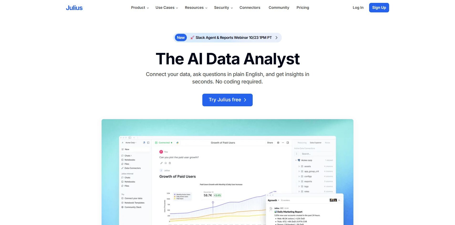
What it does: Julius turns your data into clear dashboards without any code. You can ask questions in plain English, like “What were our top products last month?” and quickly get charts, reports, or exports you can share with your team.
Who it’s for: Business users who need fast, visual insights without depending on analysts or writing SQL.
We built Julius to make working with data simple and approachable. You can type a question in plain English and get a chart or summary without waiting for custom dashboards or help from your data team.
It’s used daily for checks like revenue by product, weekly ad spend pacing, and month-end performance rollups. Julius connects directly to your databases and business apps, so you can pull answers from multiple sources without managing complex queries.
Julius’ features focus on speed and repeatability. You can save an analysis in a Notebook, rerun it with new data, and have the results sent automatically to Slack or email. That helps teams keep reports current without rebuilding them every week.
Over time, Julius also gets better at finding key drivers in your connected data, so responses come back faster and with more context. It’s a reliable way to turn raw data into clear insights your team can act on.
Key features
Natural language querying
Saved workflows and notebooks
Integrations with Google Ads, BigQuery, and Drive
Scheduled reports via email or Slack
Buy if
You want a dashboard that answers questions quickly and keeps reports current with minimal upkeep.
Don’t buy if
You need deep predictive modeling or custom-coded analytics.
Pricing
Julius offers a free plan with 15 messages per month. Paid plans start at $29.16 per month, including access to advanced reasoning, scheduling, storage, and integrations.
Bottom line
As a data analysis tool, Julius makes dashboards conversational and accessible for teams that want quick answers without technical steps. It’s ideal for marketers, product managers, and operators who need reliable insights. For advanced modeling or custom visuals, Tableau or Power BI may suit you better.
2. Tableau: Best for enterprise analytics and visualization
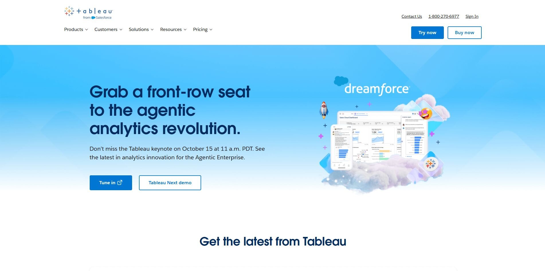
What it does: Tableau helps you analyze, visualize, and share complex datasets through customizable dashboards. It’s widely used for performance tracking, forecasting, and interactive reporting across teams.
Who it’s for: Enterprise users and data professionals who need deep analytical control and advanced visualization options.
When I used Tableau, what stood out was how much control I had over every step of the analysis. I combined financial, sales, and web traffic data into one interactive dashboard that made it easy to explore relationships between metrics.
The drag-and-drop editor helped me build visualizations quickly, but managing complex data sources still required some setup time. Once everything was connected, performance stayed consistent even with large datasets.
Sharing through Tableau Server worked well for team reporting, though the licensing costs can add up fast for bigger organizations that need multiple users. If you have the budget, it’s a strong tool for deep analysis and long-term reporting workflows.
Key features
Advanced visual customization
AI-driven data insights and forecasting
Collaboration through Tableau Server and Tableau Cloud
Wide range of data connectors
Buy if
You want enterprise-level analytics with highly customizable dashboards.
Don’t buy if
You need a lightweight tool or mostly work with small datasets.
Pricing
Tableau starts at $75 per user per month for the Creator license.
Bottom line
Tableau delivers powerful analytics and unmatched visualization depth. For smaller teams or faster onboarding, Power BI or Looker Studio might be easier to start with.
3. Power BI: Best for business reporting and Excel integration
What it does: Power BI connects data from spreadsheets, databases, and cloud apps to create detailed reports and dashboards. It’s known for its deep integration with Microsoft products like Excel and Teams.
Who it’s for: Businesses that want accessible analytics within the Microsoft ecosystem.
What I liked about Power BI when I used it before was how naturally it fit into my existing workflow. It works like an advanced version of Excel built for reporting, so importing sales and operations data from multiple sources was straightforward.
I created interactive charts that updated automatically, and the DAX formulas added flexibility for complex calculations. Sharing through Teams and OneDrive made collaboration easy, while scheduled refreshes kept everything current across departments. Publishing dashboards for executives was simple, too.
I did find that customization could get limited without Power BI Pro, and there are better tools if you aren’t deeply entrenched in the Microsoft ecosystem.
Key features
Microsoft ecosystem integration
DAX formulas for advanced calculations
Collaboration via Teams and OneDrive
Scheduled data refreshes
Buy if
You already use Microsoft 365 and need connected reporting tools.
Don’t buy if
You want full design flexibility or plan to manage data outside of Microsoft.
Pricing
Power BI starts at $14 per user per month for the Pro plan.
Bottom line
Power BI bridges spreadsheets and enterprise reporting. It’s a practical choice for Microsoft users, though non-Microsoft teams may find setup less intuitive.
4. Geckoboard: Best for real-time KPI dashboards
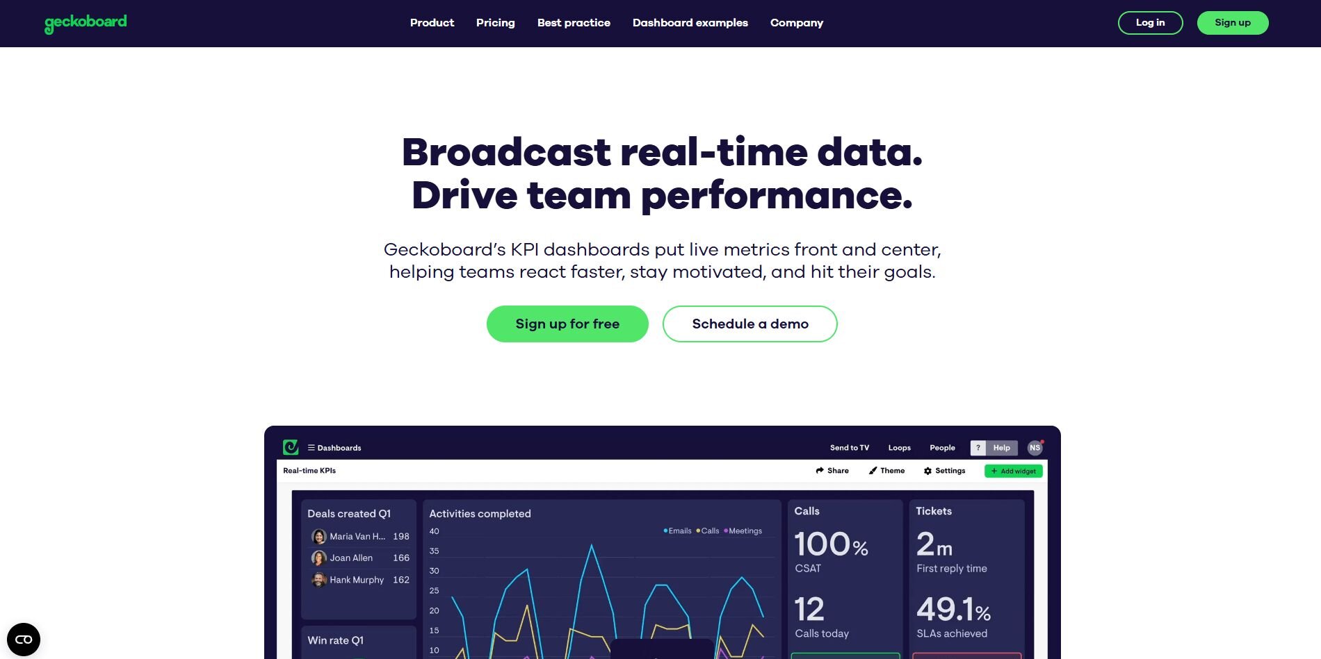
What it does: Geckoboard helps teams visualize live metrics from tools like Google Analytics, Shopify, and HubSpot. It’s built for clarity and speed, showing key performance indicators in real time.
Who it’s for: Teams that want quick visibility into performance without manual reporting.
When I tested Geckoboard, the setup process was quick. I connected Google Analytics, Shopify, and ad accounts in under an hour. The live dashboards helped me monitor conversions and sales without juggling spreadsheets. The prebuilt widgets were simple to configure, and sharing dashboards with a link made team updates relatively easy.
I don’t like that customization is limited to layout and colors, so you can’t tweak visuals as deeply as with Tableau or Power BI. But for small businesses or agencies that need a quick view of what’s happening, it’s one of the fastest tools to get running.
Key features
Real-time data visualization
Simple drag-and-drop dashboard builder
Prebuilt KPI widgets
Shareable links and TV display mode
Buy if
You want a live view of performance metrics for daily tracking.
Don’t buy if
You need advanced reporting or complex data blending.
Pricing
Geckoboard starts at $60 per month for 1 dashboard and 1 editor.
Bottom line
Geckoboard focuses on speed and visibility, making it great for tracking live sales or marketing metrics. It’s good for daily sales and campaign checks, but you may need a different tool for deeper analysis.
5. Datapad: Best for mobile-first business dashboards
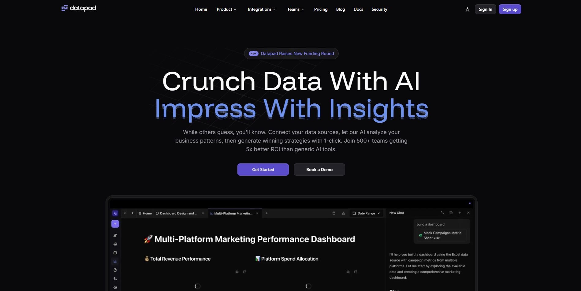
What it does: Datapad is a lightweight dashboard app designed for mobile teams. It pulls data from tools like Google Analytics, Shopify, and Facebook Ads and displays key metrics in a mobile-friendly format.
Who it’s for: Managers and small teams who need quick performance updates on the go.
I used Datapad during a campaign launch to track sales and ad results from my phone, and I liked that the setup was quick. Connecting data sources took only a few minutes, and the app organized metrics in clean, scrollable cards that refreshed automatically.
The built-in comment feature stood out because my teammates could discuss performance directly inside the dashboard. Notifications helped keep everyone updated on the go, which made it easier to manage fast-moving campaigns.
The desktop version is still limited, and advanced chart customization isn’t available yet, but for mobile reporting, it’s simple, reliable, and easy to share with the team.
Key features
Mobile-first dashboard app
Real-time data syncing
Team collaboration tools
Simple data source setup
Buy if
You want to monitor metrics on the go without complex dashboards.
Don’t buy if
You need a full desktop app, advanced analytics, or detailed visual customization.
Pricing
Datapad starts at $16 per month for the individual user plan.
Bottom line
Datapad turns data tracking into a mobile experience. It’s good for teams that prioritize simplicity and quick check-ins over deep analytics, but if you need more customization or desktop functionality, Geckoboard or Power BI might fit better.
6. FineReport: Best for enterprise data dashboards
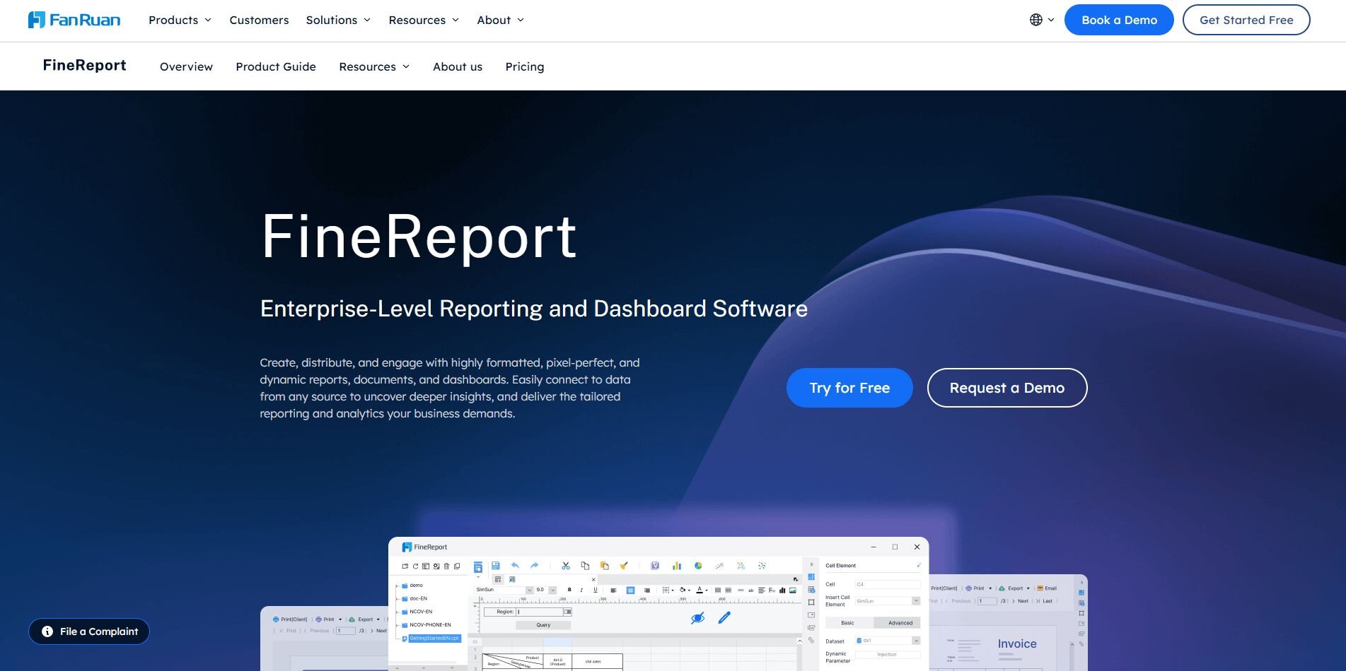
What it does: FineReport helps enterprises create interactive reports and dashboards with deep control over layout and data management. It’s part of the FineBI suite and offers strong options for large-scale data visualization.
Who it’s for: Enterprise users who need structured, customizable dashboards for reporting and internal analytics.
When I explored FineReport, I was surprised by how much control it gives over layout and formatting. I built multi-sheet data dashboards and reports that combined information from ERP and CRM systems, and the drag-and-drop editor made organizing visuals straightforward once I understood the structure.
The built-in data modeling tool helped standardize calculations across teams, though initial setup required some technical knowledge. Scheduling reports worked well for recurring financial updates, and the mobile app displayed dashboards cleanly. It’s more technical than tools like Geckoboard or Datapad, but for enterprise reporting, I think the flexibility and depth are clear advantages.
Key features
Report designer with layout control
Integration with ERP, CRM, and databases
Scheduled reporting and delivery
Mobile dashboard access
Report designer with layout control
Integration with ERP, CRM, and databases
Scheduled reporting and delivery
Mobile dashboard access
Buy if
You need customizable enterprise reports with structured data workflows.
Don’t buy if
You prefer low-code tools or need quick onboarding.
Pricing
FineReport uses custom pricing. Contact sales to learn more.
Bottom line
FineReport offers advanced control and structure for large teams. It’s powerful for enterprises, but lighter tools like Databox or Geckoboard are easier for small teams to manage.
7. Grafana: Best for system and performance monitoring
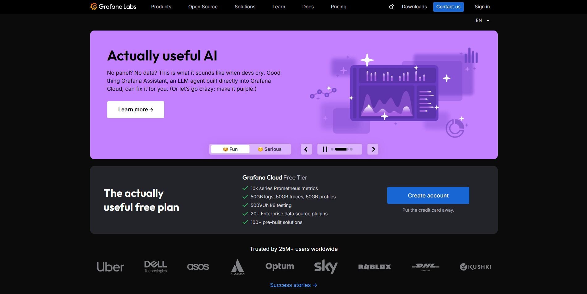
What it does: Grafana is an open-source platform for visualizing and monitoring data from servers, databases, and cloud applications. It’s often used for infrastructure metrics, uptime, and real-time analytics.
Who it’s for: Technical teams and developers who need visibility into system and application performance.
I liked Grafana for its flexibility when I connected it to a Postgres database and cloud monitoring tools. I used the dashboarding software to track CPU usage, latency, and uptime across servers in real time, which made troubleshooting faster and more precise.
The dashboard builder allows detailed customization, though it’s best suited for users comfortable with queries and configuration files. Once alerts were in place, notifications reached our team in Slack almost immediately, helping us catch issues before they grew. The interface takes some learning, but for monitoring technical systems, Grafana delivers reliable insights and control.
Key features
Real-time system and app monitoring
Highly customizable dashboards
Query-based visualizations
Alerting via Slack, PagerDuty, or email
Buy if
You manage technical infrastructure or need live monitoring tools.
Don’t buy if
You’re focused on business or marketing metrics.
Pricing
Grafana Cloud starts at $19 per month, billed monthly. Additional usage charges may apply.
Bottom line
Grafana is a great choice for engineering teams that track infrastructure and uptime in real time. It’s powerful for system metrics, but usage-based pricing can add up fast.
8. Databox: Best for marketing and sales analytics
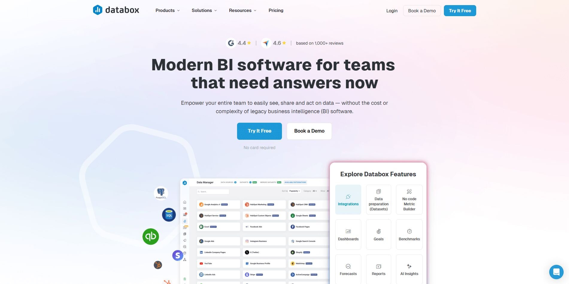
What it does: Databox centralizes marketing, sales, and web analytics in one dashboard. It pulls from dozens of integrations like HubSpot, Google Analytics, and Facebook Ads to show performance trends.
Who it’s for: Marketing and revenue teams that track KPIs across multiple platforms.
What I liked about Databox was how easy it was to connect different tools and build a BI dashboard without coding. I pulled in HubSpot, Google Ads, and Shopify data, then customized widgets to monitor conversions and revenue side by side. The prebuilt templates made setup fast, and scheduled reports helped keep clients updated automatically.
The downside is that deeper customizations, such as unique metric calculations, require higher-tier plans. Pricing can also climb quickly if you manage several clients or data sources. Even so, for marketing teams that value automation and clear reporting, Databox remains an efficient way to centralize performance tracking without extra manual work.
Key features
Prebuilt marketing and sales templates
Integration with HubSpot, Google Ads, and Facebook
Automated client and team reporting
Mobile app for performance tracking
Buy if
You manage campaigns across multiple marketing or sales channels.
Don’t buy if
You need detailed data modeling or complex formula creation.
Pricing
Databox starts at $159 per month, billed annually.
Bottom line
Databox is a practical option for marketing teams that value automation and fast setup. Its biggest drawback is the cost, with plans starting at $159 per month and rising to $799 per month for larger teams. Extra data sources also add to the total, which can make scaling expensive over time.
9. Looker Studio: Best for free business dashboards
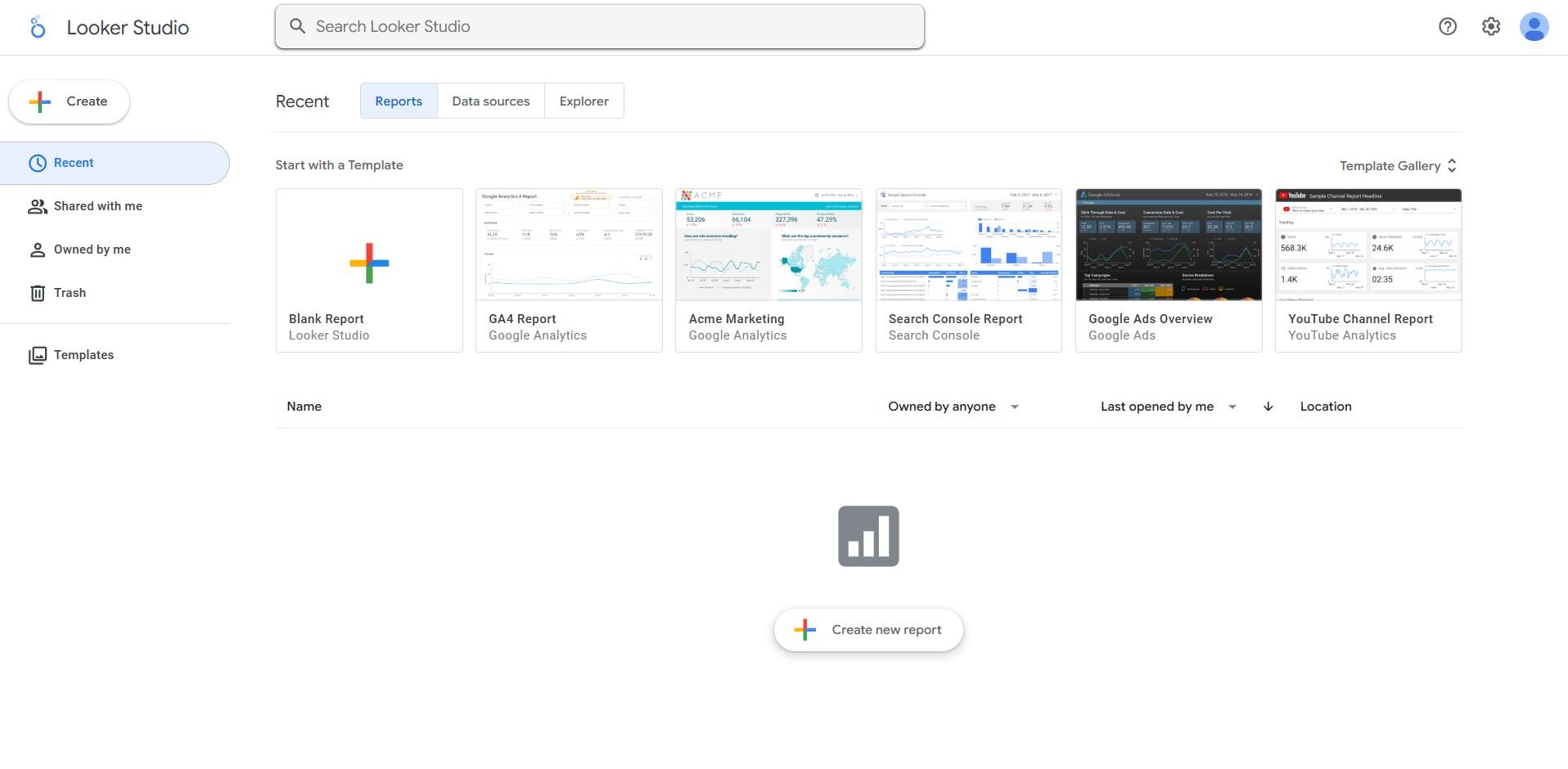
What it does: Looker Studio connects data from Google Analytics, Ads, and Sheets to create customizable dashboards and reports at no cost.
Who it’s for: Small teams, freelancers, and marketers who need basic visualizations without paid software.
What stands out about Looker Studio is how quickly you can turn spreadsheets or ad data into shareable reports. I linked Google Analytics and Ads in a few minutes, and the built-in templates helped me track campaigns without any manual exports.
The interface is simple, though it slows down with large datasets or too many filters. I also liked that collaborators could edit or comment in real time using Google permissions. For small projects or startups, it’s one of the most accessible dashboarding solutions available, giving teams a free way to visualize data and share insights without setup costs.
Key features
Free Google ecosystem integration
Real-time collaboration and sharing
Custom themes and layouts
Live data connections
Buy if
You want an easy, no-cost way to build dashboards and share insights.
Don’t buy if
You handle complex datasets or need advanced automation.
Pricing
Looker Studio is completely free to use.
Bottom line
Looker Studio is a simple, cost-effective option for creating dashboards and reports. For larger teams or performance tracking, Power BI or Databox might handle scale better.
10. Klipfolio: Best for client and agency reporting
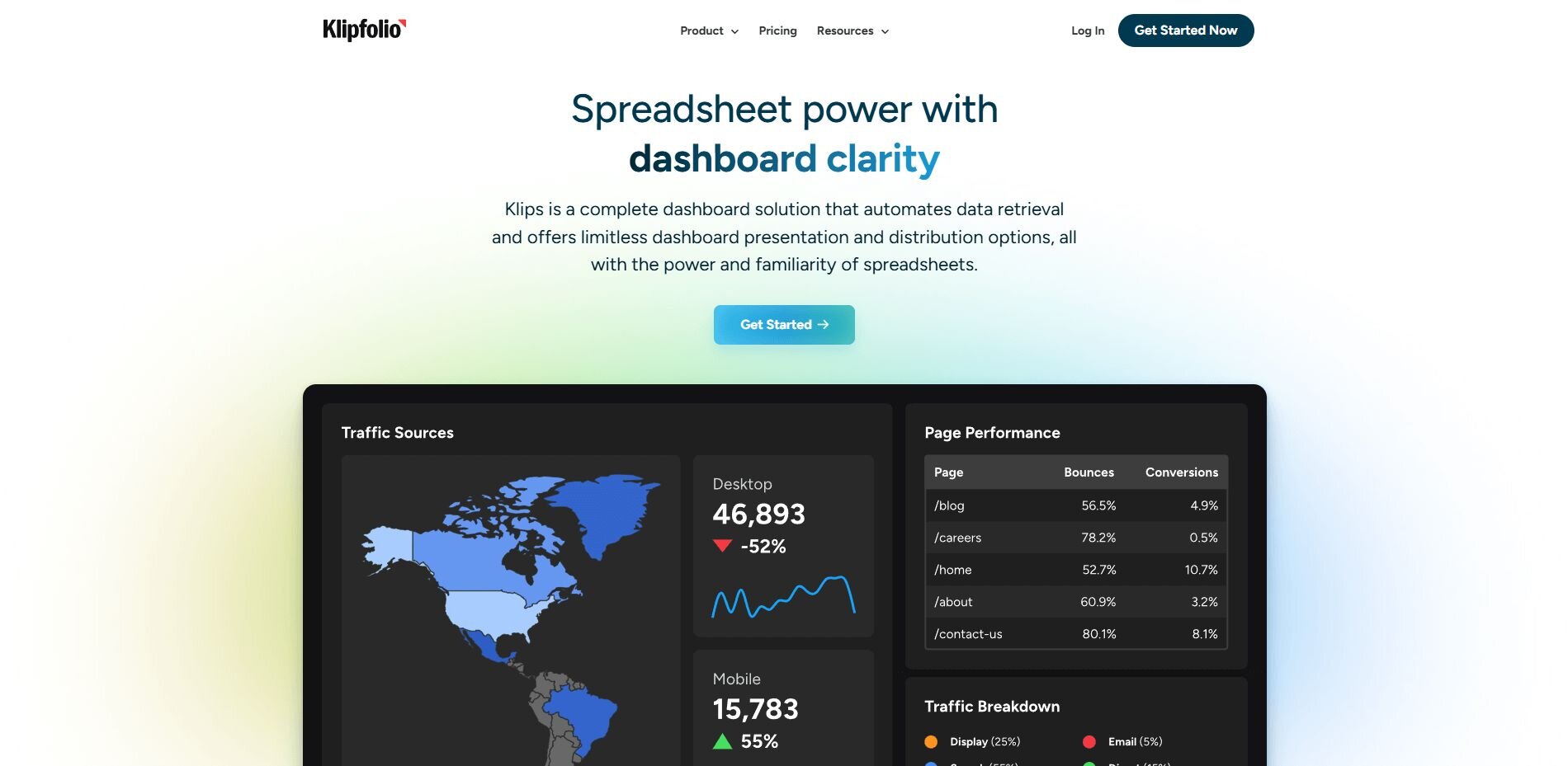
What it does: Klipfolio helps agencies and consultants build automated dashboards for multiple clients with centralized data management.
Who it’s for: Agencies that need scalable client reporting and visual customization.
Klipfolio impressed me with how efficiently it handled multiple client accounts in one place. I connected HubSpot, Facebook Ads, and Google Analytics data, then built customized dashboards for each client within a single workspace. The automation tools saved hours on recurring reports, and I scheduled branded email updates that looked professional and consistent.
Customization options were strong, but managing large data models required extra setup, and the learning curve was steeper than Geckoboard. But once everything was configured, the dashboards ran smoothly and gave me a reliable way to deliver accurate results to every client each week.
Key features
Multi-client account management
Custom branding and white-label dashboards
Automated reporting and scheduling
Support for over 100 data sources
Buy if
You run an agency or manage multiple client dashboards.
Don’t buy if
You only need a single internal dashboard or want a simpler setup.
Pricing
Klipfolio starts at $120 per month for up to 3 dashboards.
Bottom line
Klipfolio is a good choice for agencies that manage data across multiple clients and need consistent, branded dashboards. It automates reporting effectively, though setup and pricing can be high for smaller teams.
11. ClicData: Best for small business reporting
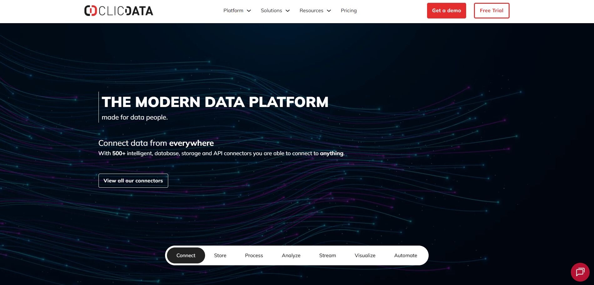
What it does: ClicData combines data management, transformation, and visualization in one platform. It’s aimed at small and mid-sized businesses that need flexibility without a full BI team.
Who it’s for: Business users who want all-in-one reporting with minimal technical setup.
When I tested ClicData, what stood out was how it merged data prep and visualization in a single interface. I uploaded sales and marketing data from Excel and CRM tools, then customized charts using drag-and-drop components. The automation features saved time on recurring reports, and alerts kept our team updated on metric changes.
The main challenge was pricing, which starts higher than many small-business tools. I also felt like the interface took a bit of time to master. Still, the combination of ETL, dashboards, and scheduling in one place made it a capable alternative to multiple disconnected apps.
Key features
Built-in ETL and data prep
Custom dashboards and alerts
Automated scheduling and notifications
Cloud data storage included
Buy if
You want a flexible all-in-one tool for data reporting.
Don’t buy if
You need enterprise-scale modeling or complex integrations.
Pricing
ClicData Cloud Plans start at $265 per month for 5 users.
Bottom line
ClicData simplifies reporting by combining prep, automation, and dashboards. It’s ideal for small teams, but the pricing may stretch tight budgets.
How I tested the best dashboarding tools
I’ve worked with dashboarding tools for years across marketing, operations, and product reporting, so I focused on how each one performs in real business use. I tested every platform hands-on, connecting live data and measuring how well it handled setup, automation, and collaboration.
Here’s what I looked at:
Ease of setup: How quickly I could connect data sources like Google Analytics, HubSpot, or Snowflake without help from engineers.
Automation: Whether reports are refreshed automatically or need manual exports each week.
Customization: How flexible the dashboards were for layout, filters, and visual design.
Collaboration: How simple it was to share insights with teammates through links, Slack, or scheduled emails.
Performance at scale: How tools managed larger datasets or multiple users without slowing down.
Value for cost: Whether pricing matched the quality, reliability, and overall time savings.
By testing each tool this way, I could see which ones simplified real reporting workflows and which ones added unnecessary friction.
Which dashboard software tool should you choose?
Your budget, team size, and reporting goals determine which dashboard platform makes sense. Choose:
Julius if you want AI-powered dashboards that answer questions in plain English without writing SQL.
Tableau if you need advanced visual analytics and full control over data exploration.
Power BI if your business already uses Microsoft tools and needs connected reporting.
Geckoboard if you want real-time performance visibility across key metrics.
Datapad if you manage a mobile team and need on-the-go dashboards.
FineReport if you work in a large enterprise that needs structured reporting and workflow control.
Grafana if you monitor infrastructure or system performance and need technical customization.
Databox if you want a marketing dashboard with automation and client reporting built in.
Looker Studio if you need free, shareable dashboards that connect directly to Google data.
Klipfolio if you run an agency and manage multiple client dashboards in one workspace.
ClicData if you want an all-in-one solution that combines data prep, dashboards, and scheduling.
These pointers help you find the dashboarding tool that fits your data goals, so you get clear insights without paying for complexity your team doesn’t need.
My final verdict
After testing these dashboard tools, what separated them wasn’t the number of features but how naturally they fit into daily work. The best platforms helped teams see changes in real time, share context easily, and move from data to action without extra steps or handoffs.
Julius stood out for making data accessible and actionable for every team member. It helps you dig into metrics, compare results over time, and generate clear visuals without writing queries. You can check trends, validate numbers, and share updates easily, all from the same workspace.
Tableau and Power BI still excel for deep modeling and enterprise control, while Geckoboard and Datapad work well for speed and simplicity. But if your goal is to make insights part of everyday teamwork instead of a technical process, Julius is the one I’d start with.
How Julius helps you get more from your data
The best dashboard software tools help you see performance clearly, but they rely on accurate, well-prepared data.
Julius gives you a faster way to explore that data and understand what drives your metrics. You can check averages, trends, and outliers, then turn those findings into visuals that guide better reporting. Julius connects to live sources so you can verify results before they hit a dashboard. That keeps every chart grounded in real numbers.
Here’s how Julius helps you explore, visualize, and share your data more effectively:
Quick single-metric checks: Ask for an average, spread, or distribution, and Julius shows you the numbers with an easy-to-read chart.
Built-in visualization: Get histograms, box plots, and bar charts on the spot instead of jumping into another tool to build them.
Catch outliers early: Julius highlights values that throw off your results, so decisions rest on clean data.
Recurring summaries: Schedule analyses like weekly revenue or delivery time at the 95th percentile and receive them automatically by email or Slack.
Smarter over time: With each query, Julius gets better at understanding how your connected data is organized. That means it can find the right tables and relationships faster, so the answers you see become quicker and more precise the more you use it.
One-click sharing: Turn a thread of analysis into a PDF report you can pass along without extra formatting.
Direct connections: Link your databases and files so results come from live data, not stale spreadsheets.
Want to see how Julius can simplify your data work and help you build clearer, more reliable dashboards? Try Julius for free today.
Frequently asked questions
Is there free dashboard software available?
Yes, there are free dashboard tools like Looker Studio that let you track key metrics without paying upfront. Looker Studio is a good option for simple dashboards that connect to Analytics or Sheets. Some platforms like Julius and Datapad also offer free tiers with limited queries or users, giving small teams enough flexibility to get started.
Can AI improve dashboard design and insights?
Yes, AI can make dashboards more effective by analyzing large datasets and revealing patterns that are easy to miss manually. It groups metrics, detects anomalies, and recommends visual formats that highlight relationships in the data.
What are KPI dashboards used for?
KPI dashboards track core metrics like sales, leads, and engagement in real time. The best KPI dashboard software pulls data from multiple sources into one place so teams can monitor progress, share updates, and stay aligned on business goals.
